Chapter 8
Visualizing Change I: Trajectories, Panels, and Comparative Displays
A graph of longitudinal data is not decoration applied after the analysis; it is analysis. The right display answers the two questions every study of change must confront, what the typical pattern is and how much people vary around it, and it answers them before a single parameter is estimated and again after, when the fitted model is laid over the data it claims to explain. This chapter is the first of two on visualization, and it treats the panel-type data of few-to-moderate occasions: growth trajectories, group comparisons, and the displays that make individual differences in change visible. It also establishes, once, the house graphical style that every later figure in the book inherits, so that aesthetics are settled here and not re-argued chapter by chapter. The governing maxim is simple: plot before you model, and plot the model after.
Learning Objectives
After working through this chapter, you should be able to: (1) choose a display from the question it must answer, whether about average change, individual differences in change, group contrasts, or moderation; (2) build layered trajectory plots that remain readable as the sample grows from tens to thousands; (3) use small multiples and lasagna plots for heterogeneity that a single overlay cannot show; (4) compare groups by plotting the difference trajectory with its own uncertainty, not two overlaid means; (5) visualize whole distributions rather than bars, and recognize why the dynamite plot and the truncated axis mislead; (6) overlay model-implied and person-specific fitted trajectories on the observed data as a standard diagnostic; and (7) produce color-vision-safe, print-robust figures and comparison-oriented tables that meet APA expectations.
8.1 Principles for Graphing Change
Effective graphics exploit the way human vision decodes quantities, and the ordering is well established: position along a common scale is read most accurately, followed by length, then angle and slope, with color and area least accurate (Cleveland & McGill, 1984). Displays of change should therefore encode the quantity of interest as position where possible, reserving color for grouping rather than for magnitude. A second perceptual fact specific to time is that a connecting line implies continuity, an assertion that the state moved smoothly from one measured point to the next, and this assertion can mislead in two common ways. When occasions are unequally spaced but plotted at equal intervals, the eye reads a constant rate of change that the data do not support; Figure 8.1 shows the same five measurements plotted against wave number and against elapsed time, and the steady decline of the first panel becomes, correctly, a sharp drop concentrated in a single interval in the second. When a line is drawn across a missing wave, it interpolates a value that was never observed, manufacturing data at exactly the point where the study has least information. The remedy in both cases is to let the horizontal axis carry real time and to break lines at genuine gaps rather than papering over them.
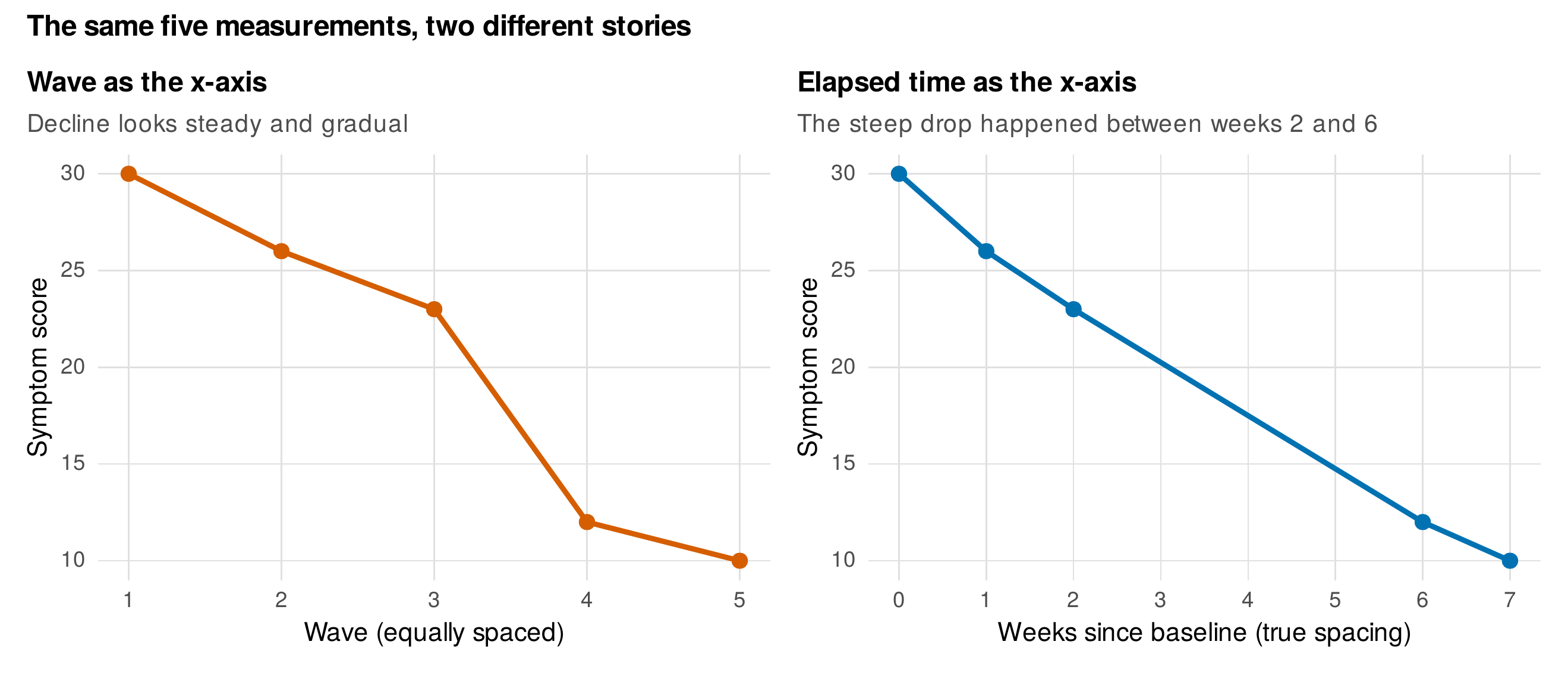
Note. Left: the five occasions plotted at equal wave spacing, suggesting a gradual, constant decline. Right: the same values plotted against elapsed time, revealing that almost all of the change occurred between weeks two and six. Unequal spacing shown as equal is one of the most common and consequential distortions in change graphics.
Every graphic of change should be built to answer two questions at once, what the typical trajectory looks like and how much individuals depart from it, and a display that shows only the average, or only the individuals, is incomplete. Table 8.1 maps common research questions to the displays that answer them, and it is the chapter’s practical index. The remainder of the chapter is organized around these questions, but a preliminary matter is the house style, defined once and reused throughout the book: a clean theme with muted gridlines, the color-vision-safe Okabe-Ito qualitative palette (Okabe & Ito, 2008), a bottom legend, and export at the physical width of the target column so that figures are legible without rescaling. The shipped file theme_book_V01.R provides the theme, the palette, and the sizing helpers, and later chapters source it rather than redefining aesthetics.
Table 8.1. Choosing a display from the question.
| The question is about … | A display that answers it |
|---|---|
| The average trajectory and its uncertainty | Mean trajectory with a confidence band; overlaid on data at small \(N\) |
| Individual differences in change | Spaghetti plot at small \(N\); small multiples ordered by slope; caterpillar of random slopes |
| Heterogeneity at large \(N\) | Lasagna plot with an informative row ordering; alpha-blended or sampled spaghetti |
| A group or condition contrast | Group-mean trajectories, and the difference trajectory with its own CI |
| Change in the whole distribution | Ridgeline or raincloud sequence across occasions |
| Moderation of change by a covariate | Faceted or color-coded trajectories; model-predicted panels at covariate levels |
| Whether the model fits | Fitted trajectories over data; observed versus model-implied means |
Note. The display follows the question, not habit. Many published change figures answer the wrong question well, showing a precise group mean where the study is about individual differences, or two overlaid groups where the estimand is their difference.
8.2 The Trajectory Workhorse and Its Scaling Problem
The spaghetti plot, one connected line per person, is the workhorse display of longitudinal data because it shows both questions at once: the cloud of lines reveals the typical pattern and the spread reveals the variation. Its weakness is scale. As the number of persons grows, the lines overplot into an illegible mass, and the display must adapt. Figure 8.2 shows the progression on the school-achievement data: at thirty children the individual lines are legible; at three hundred, alpha blending renders each line semi-transparent so that density becomes visible as depth of color while individual paths are lost; and at the full sample the only honest summary is a mean trajectory with a band, here the tenth-to-ninetieth percentile range, because no rendering of twelve hundred overlaid lines conveys anything but ink. Table 8.2 states the strategy for each regime. The general principle is that reduction is not dishonesty but design: showing all data when the result is unreadable serves no reader, and a principled summary that reveals the pattern is more truthful than an illegible tangle.
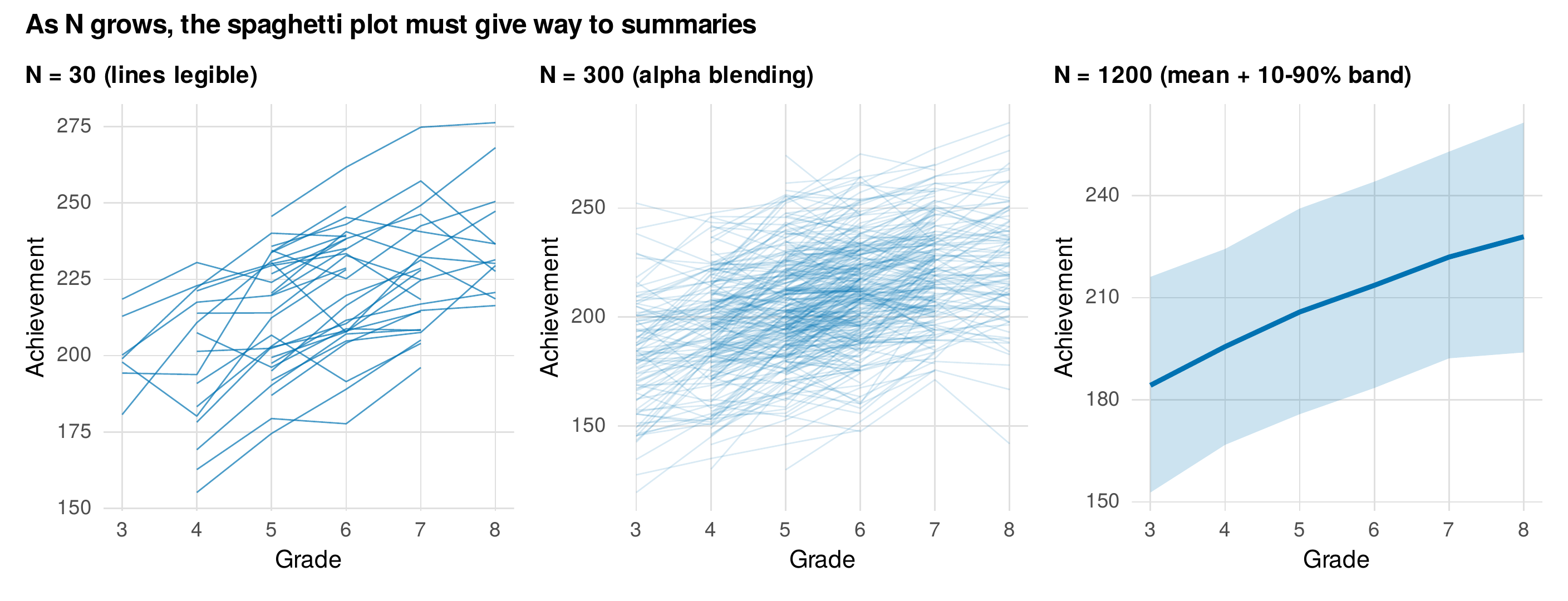
Note. The same achievement data at three sample sizes. At \(N = 30\) individual trajectories are legible; at \(N = 300\) alpha blending shows density but sacrifices individual paths; at \(N = 1200\) a mean trajectory with a \(10\)th-to-\(90\)th percentile band is the only readable option. The right display depends on the sample size, not on a fixed rule to "show all the data."
Table 8.2. Spaghetti-scaling strategies by sample-size regime.
| Sample size | Primary strategy | Notes |
|---|---|---|
| Up to \(\sim\)50 | Full spaghetti, opaque lines | Individual paths legible; add a mean overlay |
| \(\sim\)50 to \(\sim\)500 | Alpha blending; optional random sample of lines highlighted | Density visible; label or color a few exemplars |
| \(\sim\)500 to thousands | Lasagna plot, or mean with distributional band | Overlaid lines are pure ink; order lasagna rows meaningfully |
| Tens of thousands+ | Binned summaries; hexbin of slopes; small multiples of strata | Individual rendering infeasible; summarize by design |
Note. The strategies are cumulative, not exclusive: a large-\(N\) figure often shows a faint sampled spaghetti behind a bold mean-and-band, combining density and summary in one display.
The mean trajectory carries a hazard of its own, that the average of many individual processes can be a shape that no individual exhibits. Figure 8.3 reproduces the classic demonstration (Estes, 1956): twenty people who each change abruptly, stepping from a low to a high value at their own idiosyncratic moment, produce a group average that rises smoothly and gradually, a shape that misrepresents every person in the sample. The lesson is not that means are useless but that a mean trajectory must be read alongside the individual data, because aggregation can manufacture gradualness from a collection of sudden changes, an artifact with deep implications for how theories of change are tested (a theme that returns in the discussion of ergodicity in Chapter 1 and the dynamic models of Part VI).
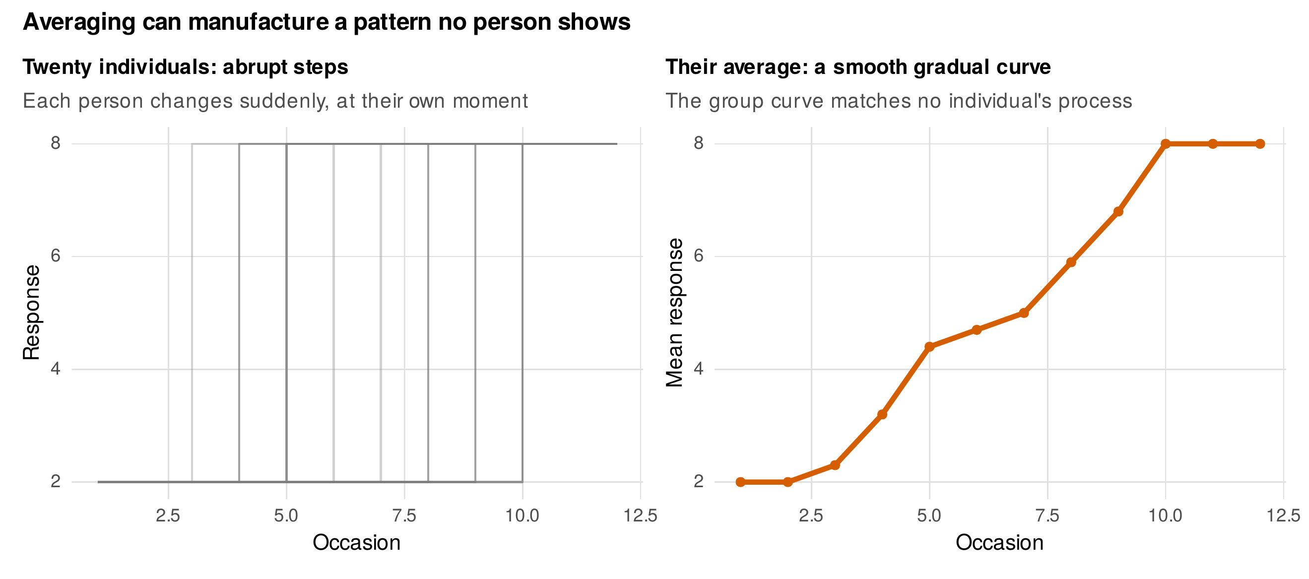
Note. Left: twenty individuals who each change abruptly, at different moments. Right: their average is a smooth, gradual curve that matches no individual’s step-like process. The mean trajectory is a valid summary of central tendency but a potentially misleading portrait of process; read it alongside the individual data.
When individual differences are the point, small multiples render each person in a separate panel, and the design decision that makes them informative is the ordering of the panels. Figure 8.4 shows twenty children each in their own panel, ordered by the slope of a line fitted to their data, so that the grid becomes a readable gradient from steep decliners to steep gainers rather than an arbitrary jumble; ordering by baseline level, or by a covariate, answers different questions and is equally legitimate, but ordering by identification number wastes the display. For larger samples the lasagna plot replaces the tangle of lines with a heatmap, one row per person and one column per occasion, the cell shaded by the value, and here too the row ordering is the essential choice. Figure 8.5 shows the same eighty children ordered by baseline achievement and by growth slope, and the two orderings surface different structure, a baseline gradient in the first and a fanning of trajectories in the second (Swihart et al., 2010). The white cells reflect the accelerated cohort design, in which each child is observed in only four of the six grades, and the display makes that structure visible rather than hiding it.
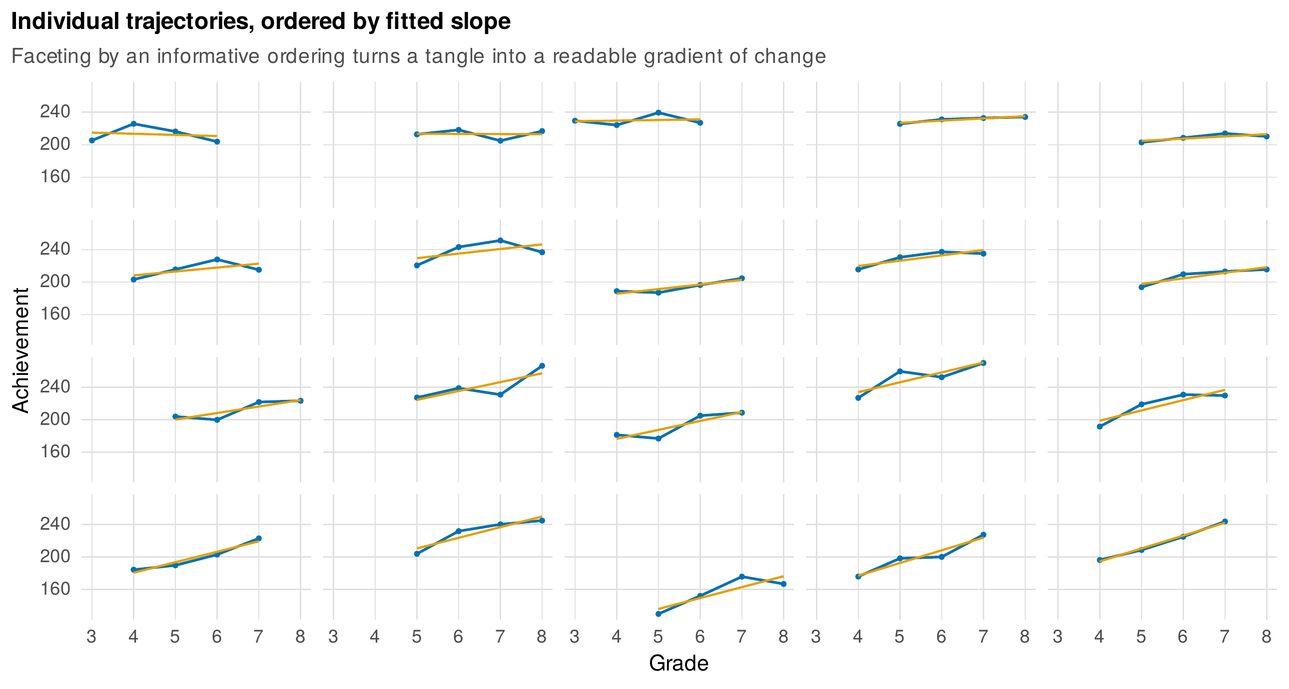
Note. Twenty children, each in a panel, with the panels ordered by the slope of an ordinary least squares line fitted to that child’s data (orange). An informative ordering turns small multiples from a jumble into a readable gradient of change, from the steepest decliners to the steepest gainers.
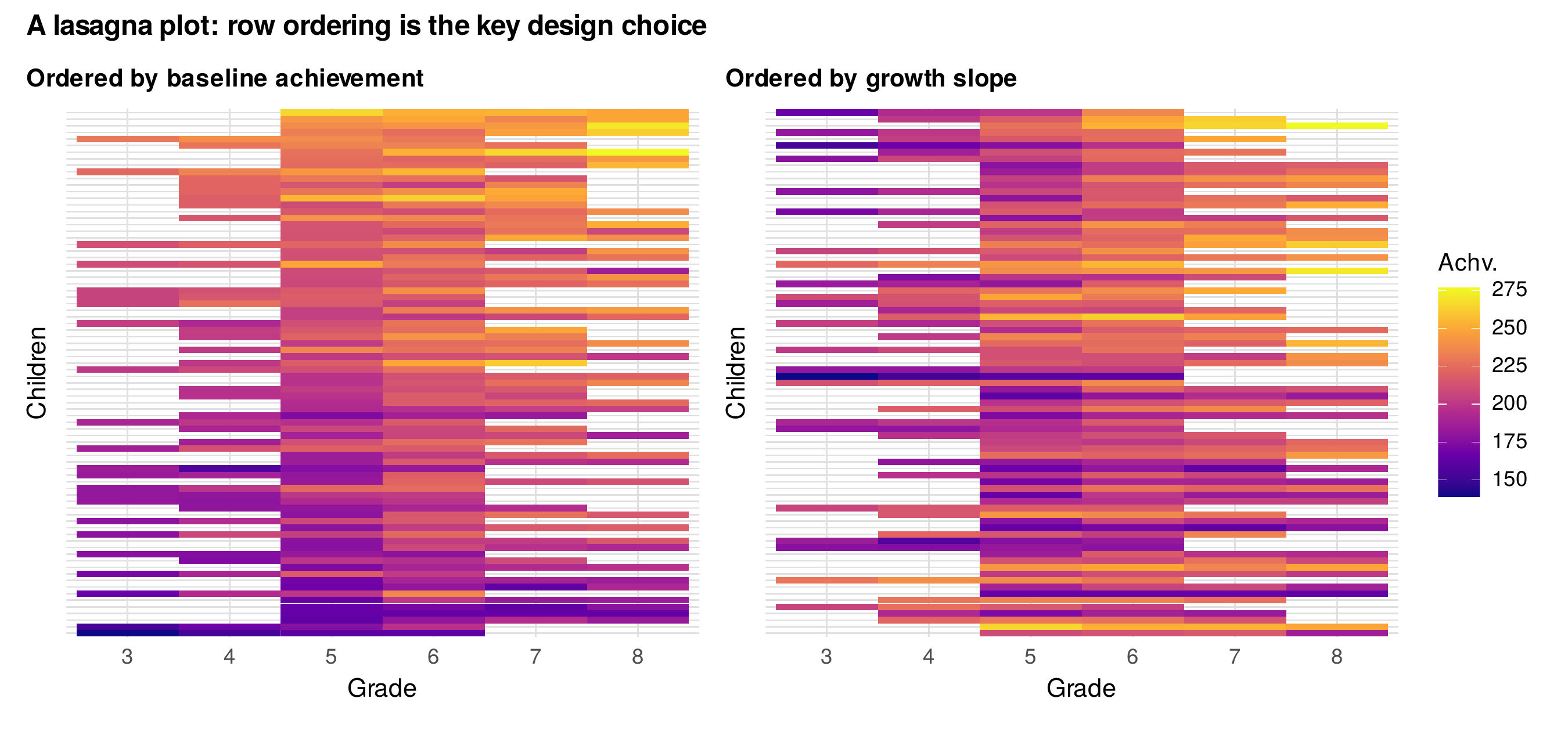
Note. Eighty children as a person-by-grade heatmap, shaded by achievement. Ordering rows by baseline achievement (left) surfaces the starting-level gradient; ordering by growth slope (right) surfaces differences in rate of change. White cells reflect the accelerated cohort design, in which each child spans only four grades. For large samples the lasagna plot is the readable alternative to overplotted spaghetti.
8.3 Comparing Groups and Conditions Over Time
When the study contrasts groups, the instinct is to overlay their mean trajectories, and that display is useful, but it is rarely the estimand. The quantity a two-arm trial is designed to estimate is the difference between the arms over time, and that difference deserves its own panel with its own uncertainty. Figure 8.6 shows the therapy trial both ways: the left panel overlays the two arms with confidence ribbons, and the right panel plots the treatment-minus-control difference with a confidence interval that widens as attrition accumulates and crosses further below zero as the treatment advantage grows, reaching roughly six depression-scale points by the final week. The difference panel states the result directly, whereas the reader of the overlay panel must perform the subtraction by eye and cannot see the uncertainty in the contrast at all. Plotting the contrast is the visual counterpart of reporting the interaction rather than the two simple slopes.
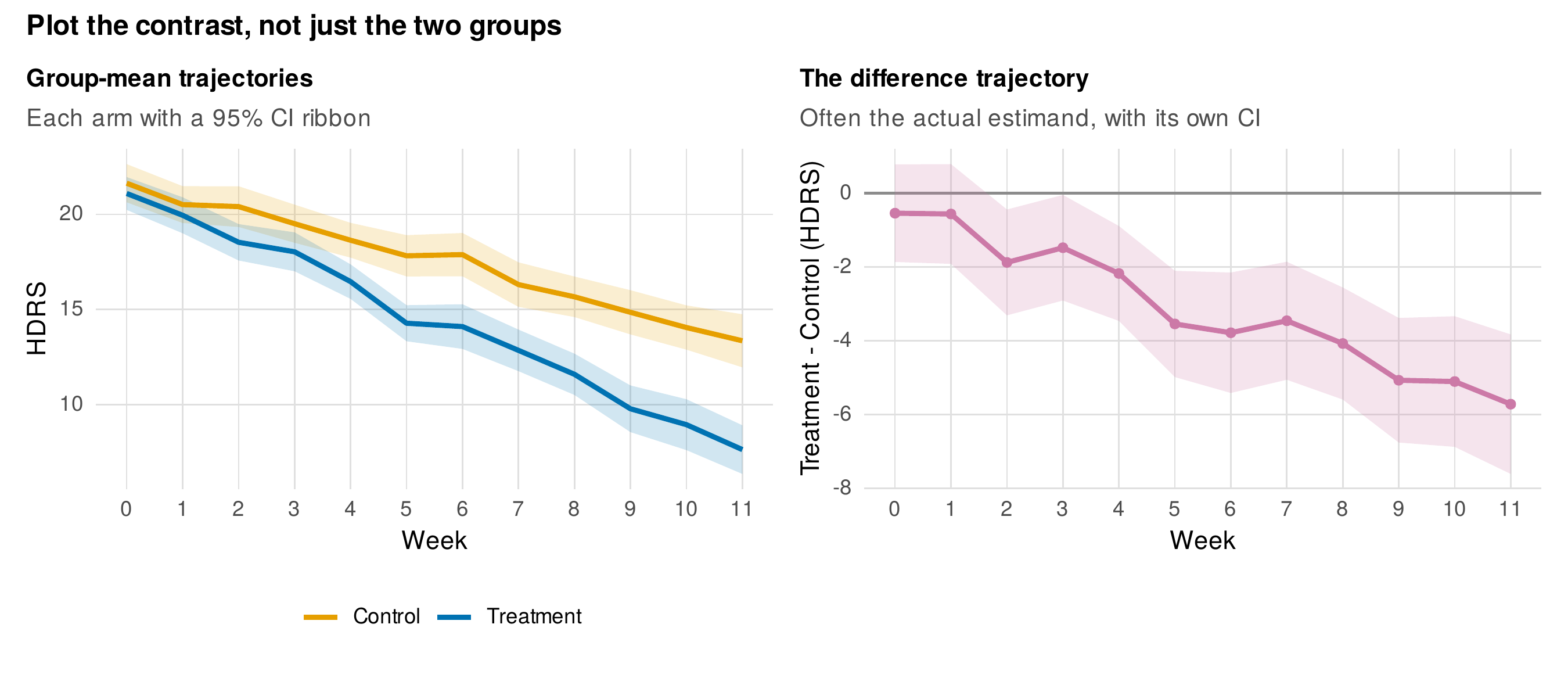
Note. Left: mean HDRS trajectories for the two arms with \(95\%\) confidence ribbons. Right: the treatment-minus-control difference trajectory with its own confidence interval, which is the trial’s actual estimand. The difference panel shows both the effect and its growing uncertainty directly, where the overlay leaves the reader to subtract by eye.
For a two-occasion contrast the same principle indicts a widespread display. The dynamite plot, a bar reaching to the group mean topped by an error whisker, discards the entire distribution and shows only two summary statistics, and it is especially misleading for change because it hides whether individuals moved together or in opposite directions. Figure 8.7 sets it against a paired-line chart of the same data, in which each patient’s baseline and endpoint are connected, so that the heterogeneity of response, some patients improving markedly and others little, is visible along with the mean (Weissgerber et al., 2015). The bar chart’s two rectangles could be produced by many different patterns of individual change, most of them clinically distinct, and the paired display distinguishes them. The general recommendation follows: show the distribution and, for repeated measures, show the within-person change, and reserve bars for counts, the one quantity they encode honestly.
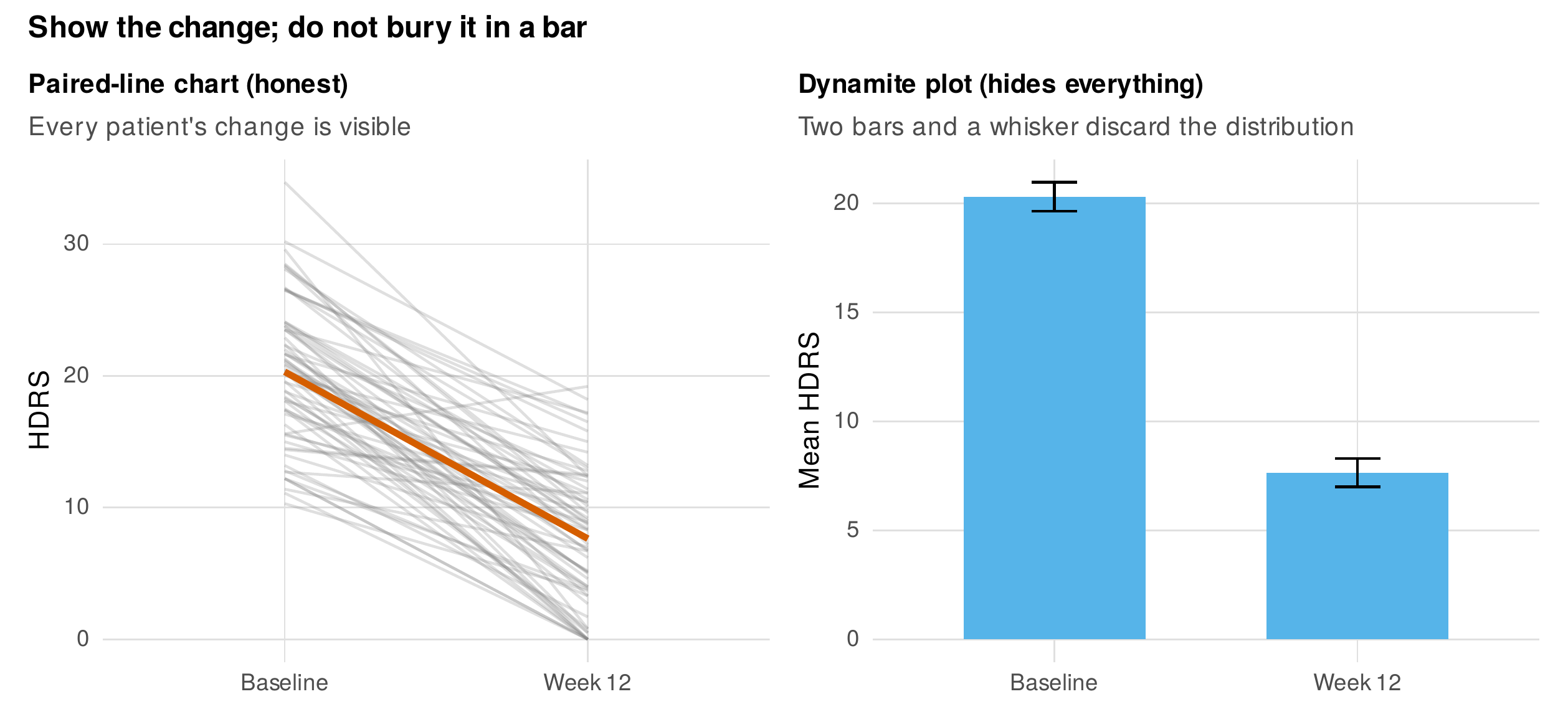
Note. Left: a paired-line chart connecting each treated patient’s baseline and endpoint, with the mean change in bold; individual heterogeneity is visible. Right: a dynamite plot of the same data reduces it to two bars and two whiskers, discarding the distribution and the within-person change. The two displays are built from identical numbers.
Groups can also be compared through the evolution of the whole distribution rather than its mean, which matters when floor or ceiling effects or changing skew are part of the story. Figure 8.8 shows the distribution of achievement at each grade as a ridgeline sequence, revealing that the distribution both shifts upward and spreads as children progress, a widening of individual differences that a sequence of means would entirely conceal. Distributional displays of this kind, ridgelines and their raincloud relatives, are increasingly expected where the shape of the distribution, not merely its center, carries substantive meaning (Allen et al., 2019; Rousselet et al., 2017).
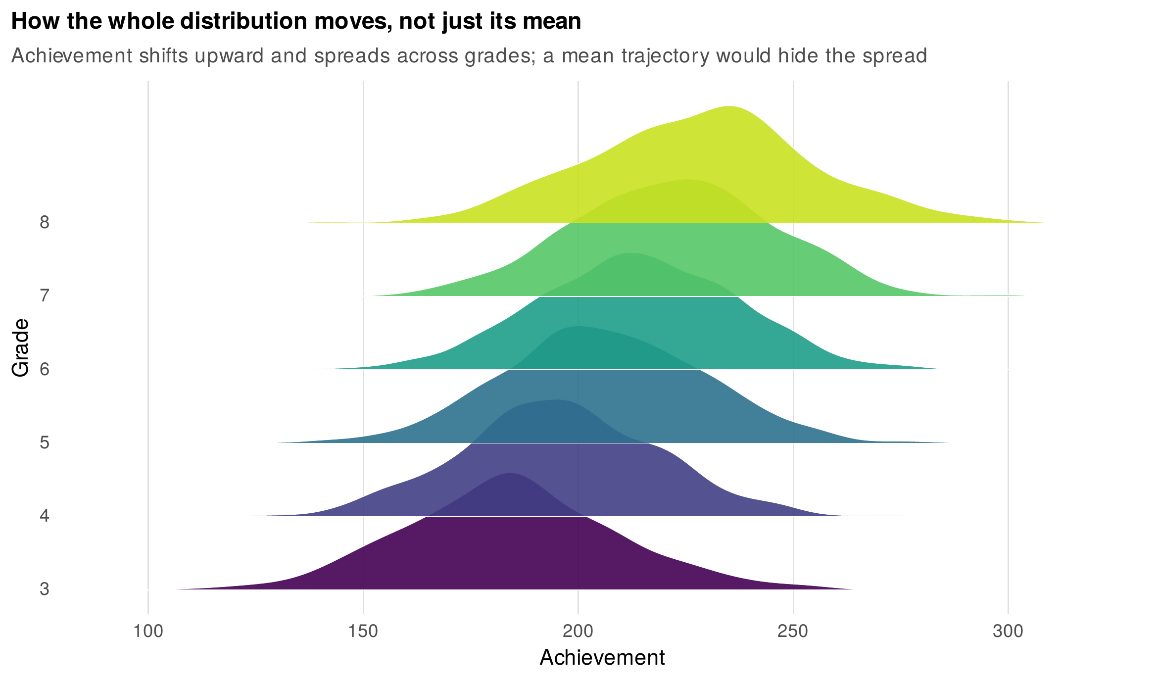
Note. The distribution of achievement at each grade, as a ridgeline sequence. Achievement shifts upward and its spread widens across grades, a growth in individual differences that a trajectory of means would hide. Distributional displays are the right choice when the shape, not only the center, is of interest.
8.4 Covariates and Change
To show how a covariate relates to change, the two workhorses are faceting and model-based prediction. Faceting or color-coding trajectories by levels of a moderator shows the raw pattern within each stratum, and model-predicted trajectories at chosen covariate values show the fitted moderation cleanly, without the noise of the raw data. Figure 8.9 shows both for the therapy trial with patient age as the candidate moderator: the left panel facets the raw group means by age tertile, and the right panel plots model-predicted trajectories for each arm at one standard deviation below and above the mean age. In these data the age moderation of the treatment slope is modest, and the display honestly shows it as modest rather than exaggerating a weak effect, which is itself a virtue of the model-predicted panel, that it renders the estimated moderation at its true size. The predicted-trajectory approach previews the model-based visualization of Chapters 13 and 14, where fitted effects are plotted with tools built for the purpose. The between-person and within-person scatterplots of Chapter 7 are the other standard covariate display, and they should accompany any claim that an association operates at a particular level.
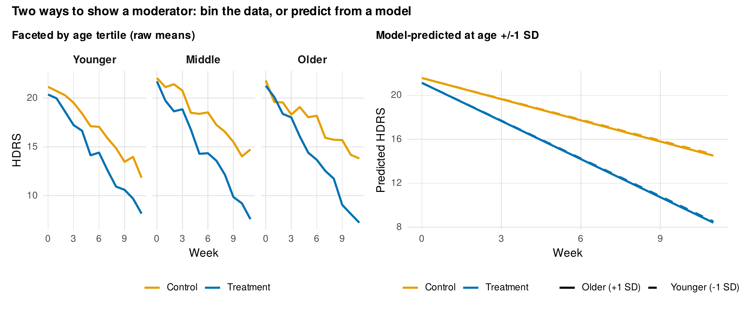
Note. Left: raw HDRS trajectories faceted by age tertile. Right: model-predicted trajectories for each arm at age one standard deviation below and above the mean. The age moderation of the treatment slope is modest in these data, and the model-predicted panel shows it at that true, modest size rather than exaggerating it.
8.5 Plotting the Model, Not Just the Data
The maxim to plot the model after fitting it produces the most important diagnostic displays in longitudinal work, and the first is the overlay of fitted trajectories on the observed data. Figure 8.10 shows the standard form: the observed data in grey, the person-specific fitted trajectories from a fitted growth model in thin blue, and the fixed-effect average trajectory in bold. The person-specific fits are the model’s best linear unbiased predictions, the shrinkage estimates of each individual’s trajectory, and seeing them fan around the average communicates the random-slope variance in a way no variance-component table can. This display is mandatory for every model-fitting chapter that follows, and its standard form is defined here. Its companion is the caterpillar plot of Figure 8.11, which ranks the individual random effects with their uncertainty intervals, so that the reader can see both the spread of individual growth rates and which individuals depart reliably from the average; children whose interval excludes zero grow reliably faster or slower than the typical child.
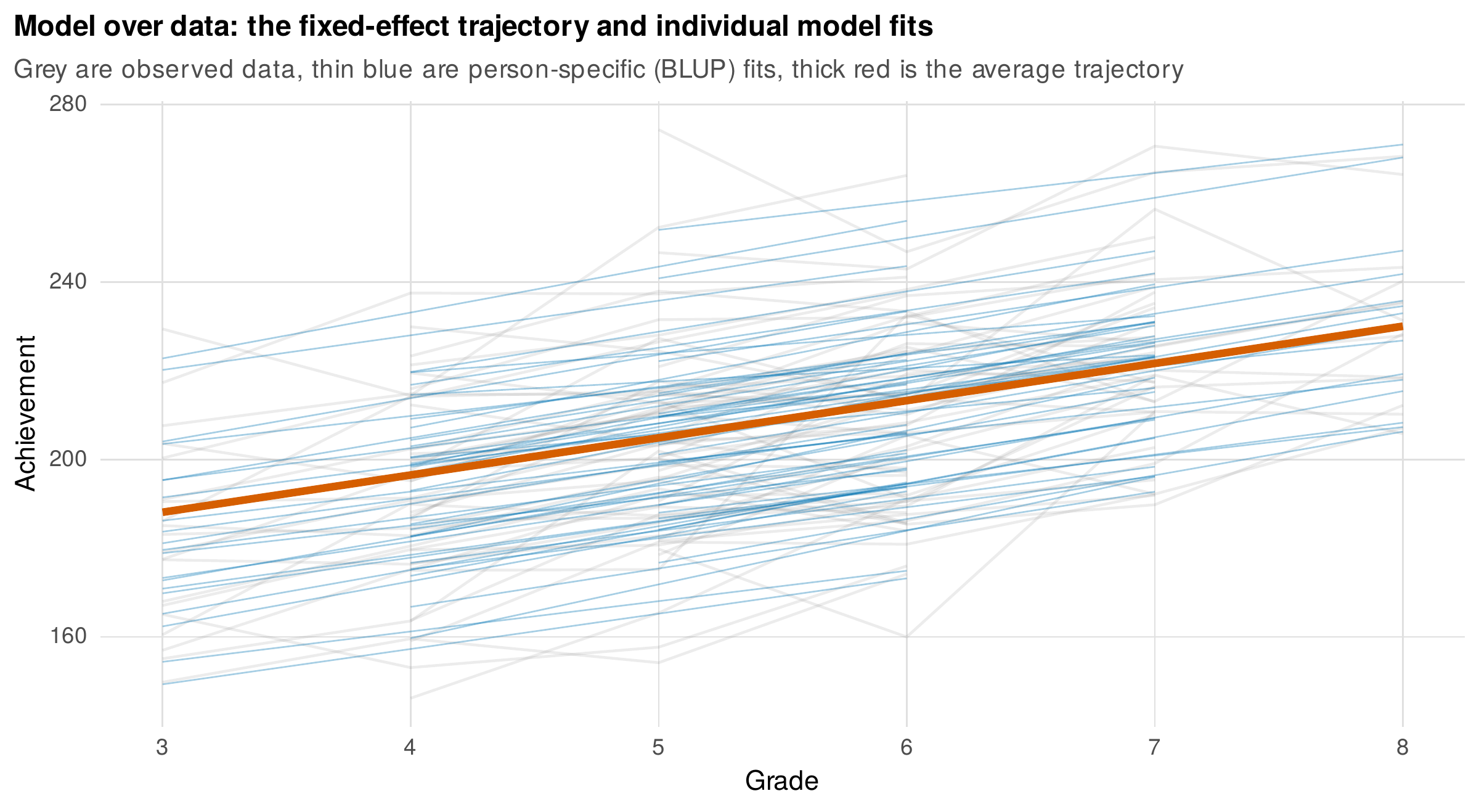
Note. Observed achievement data (grey), person-specific fitted trajectories from a linear growth model (thin blue, the empirical Bayes predictions), and the fixed-effect average trajectory (bold red). The fan of individual fits displays the random-slope variance directly. This overlay of model on data is the standard fit-checking display used throughout the book.
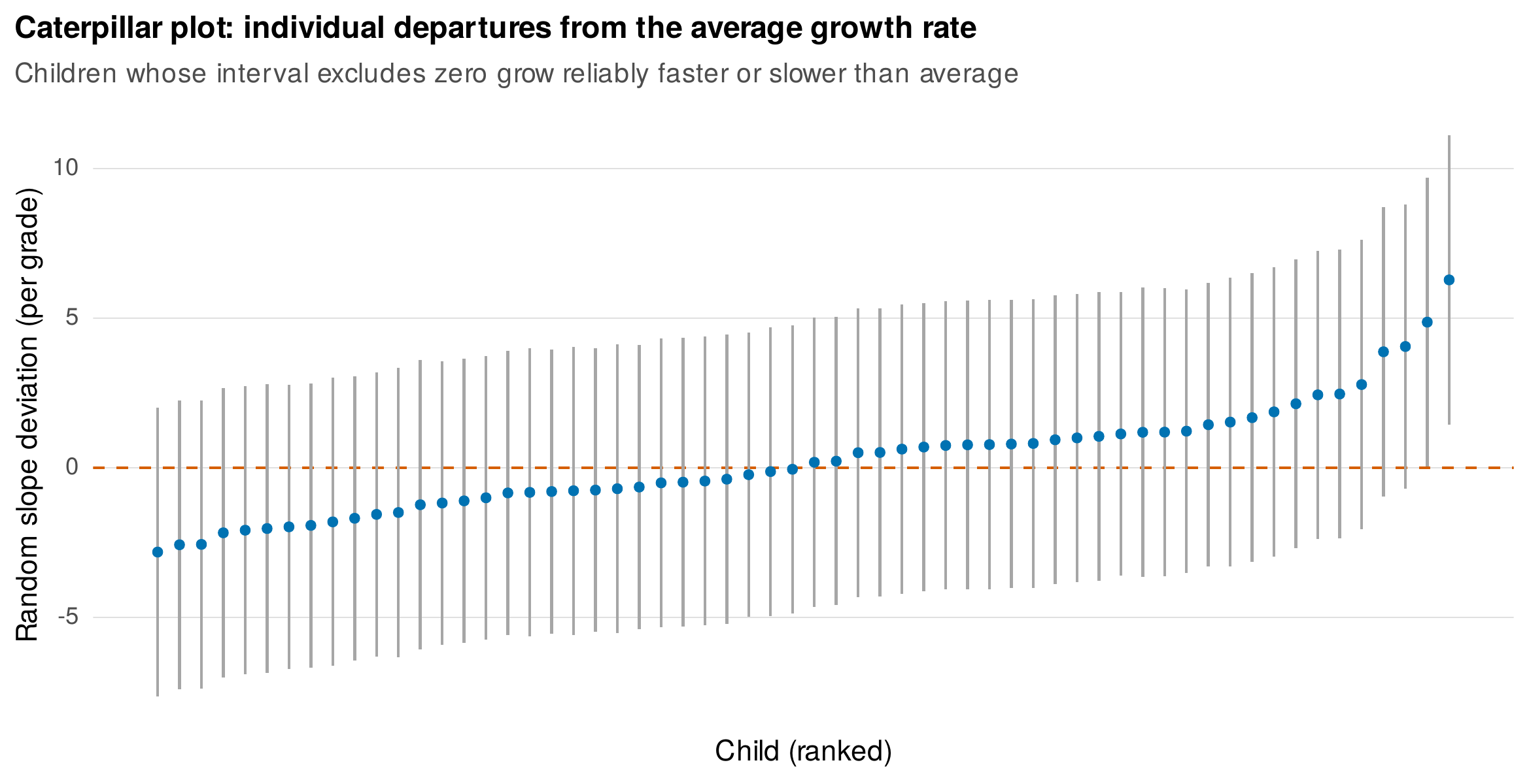
Note. Estimated random-slope deviations for sixty children, ranked, with \(95\%\) intervals. Children whose interval excludes the dashed zero line grow reliably faster or slower than the average child. The caterpillar plot conveys both the spread of individual growth rates and the certainty with which each departs from the mean.
The third model display checks the mean structure directly by overlaying the observed group means on the model-implied means at each occasion, as in Figure 8.12. A close correspondence supports the functional form, here a linear trajectory that tracks the observed grade means well, while a systematic gap, model-implied means that bow away from the observed at particular occasions, is a visible signature of misspecification, such as fitting a straight line to a curved process. This observed-versus-implied comparison is the workhorse diagnostic for the growth and structural-equation models of Parts IV and V, and defining its standard form here means later chapters can invoke it without re-explaining it.
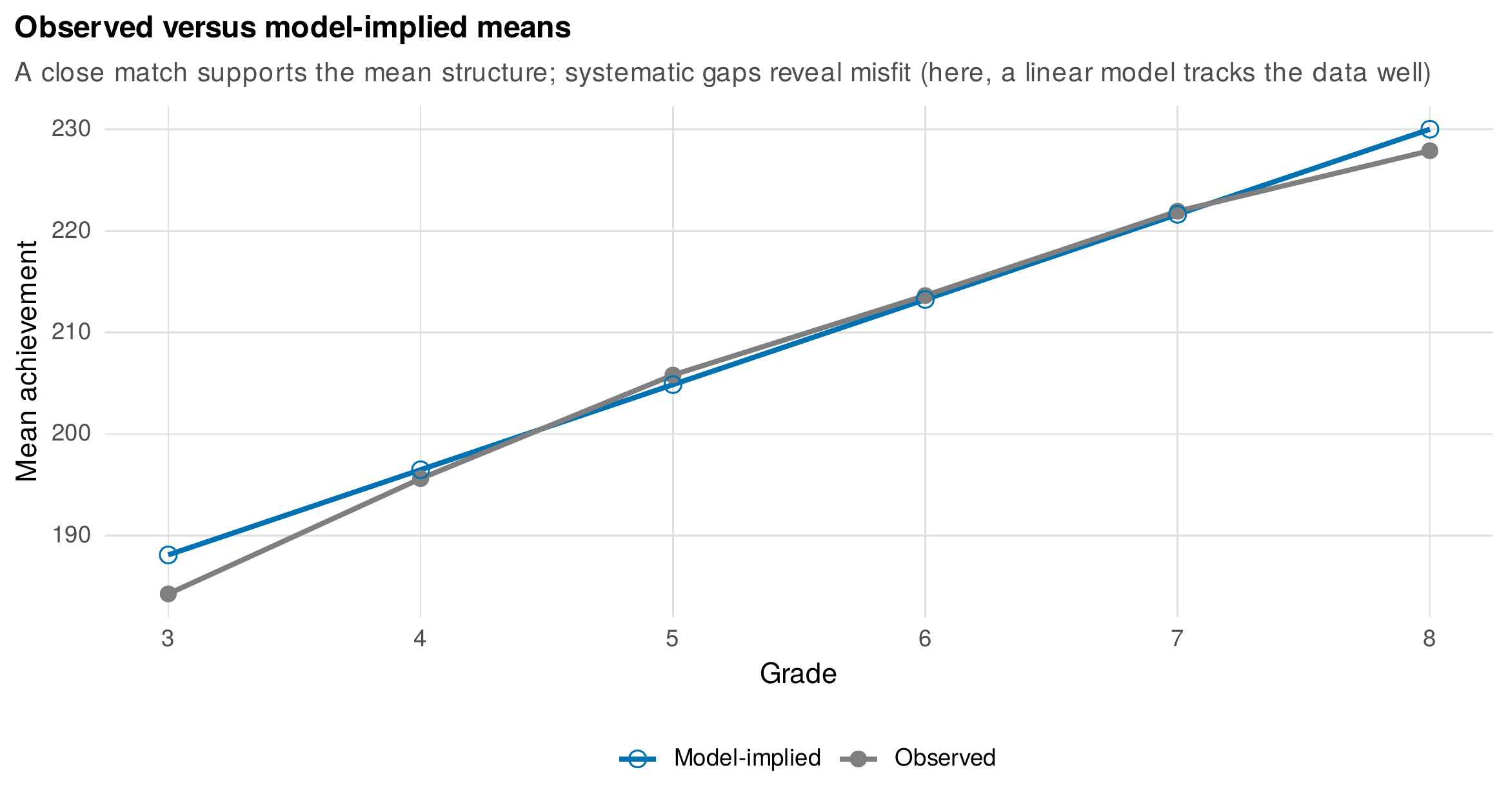
Note. Observed mean achievement at each grade (grey) against the means implied by the fitted linear growth model (blue). The close match supports the linear mean structure; systematic departures at particular occasions would reveal misfit. This is the book-standard diagnostic for evaluating a model’s mean structure.
8.6 Tables, Export, and Reproducibility
Figures carry the pattern; tables carry the precise values a reader may need to reuse, and a good longitudinal results table is designed for comparison rather than mere completeness. Its numbers are rounded to the two or three significant digits that carry information (Ehrenberg, 1977), its rows and columns are arranged so that the comparisons the reader will make run down columns where the eye compares most accurately, and its structure separates fixed-effect estimates, random-effect variances, and fit statistics into labeled blocks. The descriptive Table 1 of Chapter 7 is the entry point, and model-comparison and parameter tables follow the same discipline. Table 8.3 collects the APA figure and table requirements the book follows. The final concerns are export and reproducibility: figures are saved as vector graphics at the physical width of the target column so that text remains legible, checked under a color-vision simulation because the Okabe-Ito palette is chosen precisely to survive that check, accompanied by descriptive alt text, and, above all, generated by a script so that every figure in the book can be reproduced exactly, the policy that the companion repository enforces with one script per figure.
Table 8.3. APA figure and table compliance checklist.
| Element | Requirement |
|---|---|
| Figure caption | Brief title above the figure in the book’s style; a note below defines symbols, colors, and line types, and describes visual mechanics only, not results |
| Table caption | Brief, italicized title above the table; a note below, left-aligned |
| Rules | Horizontal rules only (top, mid, bottom); no vertical rules |
| Color | Color-vision-safe palette; redundant coding by shape or line type so groups are distinguishable in grayscale |
| Axes | No truncated axes for change claims; real time on the horizontal axis; no dual vertical axes |
| Uncertainty | Error bands labeled as to what they represent (SD, SE, CI); for repeated measures, computed to respect non-independence |
| Reproducibility | Every figure generated by a saved script; vector export at final print width |
Note. The checklist aligns with APA style and the book’s LaTeX standards. Its purpose is that a figure or table can be read correctly, in color or in grayscale, at final size, and regenerated from code.
Common Pitfall • three distortions to refuse
First, connecting lines across missing waves: a line drawn over an unobserved occasion interpolates data that do not exist; break the line at the gap. Second, truncated axes for change: beginning the vertical axis above zero, or zooming it tightly, magnifies a trivial change into a dramatic one, and for claims about the magnitude of change the axis must not be truncated to exaggerate. Third, naive confidence ribbons on repeated measures: a confidence band computed from the raw standard error at each occasion ignores that the same people are measured repeatedly, so it misstates the uncertainty in a within-person comparison; either compute a within-subject interval (Cousineau, 2005; Morey, 2008) or label the band as a descriptive spread rather than an inferential interval.
8.7 Building the Displays in R
This chapter shows more code than most, because its craft is executed rather than described. The house style is loaded once and set globally, after which every figure inherits it.
library(ggplot2); library(dplyr); library(tidyr); library(patchwork); library(lme4)
source("Examples/R/theme_book_V01.R")   # theme_book(), ok_palette, save_fig()
theme_set(theme_book())

sg <- readRDS("Examples/data/school_growth.rds") |> mutate(grade_c = grade - 3)
The layered trajectory display, the workhorse of Section 8.2, is a spaghetti of individuals with a mean overlay, and its scaling is controlled by the transparency of the individual lines.
# --- Layered spaghetti with a mean overlay ---
ggplot(sg, aes(grade, achievement)) +
  geom_line(aes(group = child_id), alpha = 0.08, color = ok_palette["blue"]) +
  stat_summary(fun = mean, geom = "line", color = ok_palette["vermillion"],
               linewidth = 1.3) +
  labs(x = "Grade", y = "Achievement")
The difference trajectory of Section 8.3 is computed by summarizing each arm, reshaping to wide, and subtracting, with the standard error of the difference obtained by combining the arm standard errors; the model-over-data overlay of Section 8.5 fits the growth model once and predicts both the person-specific and the fixed-effect trajectories.
# --- Difference trajectory with its own CI (therapy_rct) ---
rct <- readRDS("Examples/data/therapy_rct.rds")
gm <- rct |> group_by(arm, week) |>
  summarise(m = mean(hdrs, na.rm = TRUE),
            se = sd(hdrs, na.rm = TRUE) / sqrt(sum(!is.na(hdrs))), .groups = "drop")
diff <- gm |> pivot_wider(names_from = arm, values_from = c(m, se)) |>
  mutate(d = m_Treatment - m_Control, sed = sqrt(se_Treatment^2 + se_Control^2))
ggplot(diff, aes(week, d)) +
  geom_hline(yintercept = 0, color = "grey55") +
  geom_ribbon(aes(ymin = d - 1.96 * sed, ymax = d + 1.96 * sed), alpha = 0.2) +
  geom_line(linewidth = 1)

# --- Model over data: fixed-effect and BLUP trajectories ---
m_sg <- lmer(achievement ~ grade_c + (1 + grade_c | child_id), data = sg)
sg$blup <- predict(m_sg)                                   # person-specific fits
fixed  <- data.frame(grade = 3:8, grade_c = (3:8) - 3)
fixed$fit <- predict(m_sg, newdata = fixed, re.form = NA)  # average trajectory
The complete, reproducible code for all twelve figures, including the lasagna orderings, the caterpillar extraction of random effects with their conditional variances, and the observed-versus-implied comparison, is the shipped script ch08_figures_V01.R, and the house-style definitions are in theme_book_V01.R.
Software Note • composition and table tooling
Multi-panel figures in this book are composed with patchwork, whose + operator places plots side by side, / stacks them, and plot_layout(guides = "collect") merges shared legends; plot_annotation() adds an overall title. For publication tables rendered from R, gt produces polished HTML and LaTeX output with a grammar-of-tables syntax, while flextable targets Word documents through officer and is preferable when the deliverable is a manuscript in Word; both enforce the horizontal-rules-only, notes-below conventions of APA style. The choice between them is driven by the output format, not by the table’s content.
In Practice • export settings that survive production
Save figures as vector PDF or SVG rather than raster PNG wherever the figure is line art, so that it remains sharp at any magnification; reserve raster export for figures with thousands of overplotted points, where a vector file becomes unwieldy, and then export at a high resolution. Size the figure at the physical width of its destination, roughly \(3.4\) inches for a single journal column and \(7\) inches for a full text width, and set the base font size so that axis labels are legible at that size, because a figure designed at screen size and shrunk to a column loses its text. Check the result under a color-vision-deficiency simulation, embed fonts on export, and keep the generating script under version control so the figure can be regenerated when the data or the style changes.
8.8 Common Misconceptions
Several beliefs about graphing change do harm. The first is that figures are decoration and the tables carry the results; in the study of change the figure often is the result, because a trajectory plot reveals functional form, heterogeneity, and misfit that no table conveys, and the observed-versus-implied display is a formal diagnostic, not an ornament. The second is that one should always show all the data; an illegible mass of ten thousand overplotted lines shows nothing, and principled reduction to a summary that reveals the pattern is more honest than a tangle that hides it. The third is that an error bar is an error bar; the standard deviation, the standard error, the confidence interval, and the prediction interval answer different questions, and for repeated measures the naive between-subject interval misstates the within-subject uncertainty, so the quantity a band represents must always be stated. A recurring question, color or shape to distinguish groups, is best answered by using both, because redundant coding keeps groups distinguishable for readers with color-vision deficiency and in grayscale reproduction.
Chapter Summary
A graph of change is analysis, and the right graph answers the two questions of what the typical pattern is and how much people vary around it. Displays are chosen from the question (Table 8.1): the spaghetti plot shows both questions at small \(N\) but must yield to alpha blending, lasagna plots, and summaries as the sample grows (Figure 8.2), and the mean trajectory it summarizes can misrepresent a collection of abrupt individual changes as smooth (Figure 8.3). Individual differences are shown by small multiples ordered informatively (Figure 8.4) and by lasagna plots whose row ordering is the key design choice (Figure 8.5). Group contrasts are shown by plotting the difference trajectory with its own uncertainty, not two overlaid means (Figure 8.6), and change is shown through whole distributions rather than through dynamite plots that discard them (Figures 8.7, 8.8). Moderation is shown by faceting and by model-predicted panels at covariate values (Figure 8.9). After fitting, the model is plotted over the data as fixed and person-specific trajectories (Figure 8.10), as a caterpillar of random effects (Figure 8.11), and as observed versus model-implied means (Figure 8.12), the standard diagnostics reused throughout the book. Unequal spacing shown as equal, truncated axes, interpolation across missing waves, and naive repeated-measures error bands are refused. The house style is defined once here and inherited everywhere, and every figure is generated by a script.
Where to Go Next
The next chapter carries these principles into intensive longitudinal data, where hundreds of occasions per person demand displays that this chapter’s panel-scale methods only begin to address, and where time itself becomes a richer object through cycles, events, and continuous sampling. The house style, the layered-trajectory logic, and the three model-over-data diagnostics defined here recur in every modeling chapter that follows: the growth models of Chapters 13 and 14 lean on the fixed-plus-BLUP overlay and the observed-versus-implied comparison, the multilevel diary models of Chapter 23 extend the moderator displays, and the reporting synthesis of Chapter 36 returns to the table and accessibility standards collected here. The single commitment is that no model is reported without a figure that shows it standing over the data it claims to explain.
Exercises
- 8.1 Rebuild a bad figure. Given a dynamite plot on a truncated axis, reconstruct the underlying data and produce two defensible alternatives, a paired-line display and a distributional display, and justify in a paragraph why each is more honest than the original.
- 8.2 Order a lasagna. Build a lasagna plot of
school_growthunder three row orderings, by identification number, by baseline achievement, and by growth slope, and explain what structure each ordering reveals or conceals. - 8.3 Plot the contrast. For
therapy_rct, produce the difference-trajectory plot with a correctly computed confidence interval for the treatment-minus-control difference, and write the one-sentence interpretation the panel supports. - 8.4 Model over data. Fit the linear growth model of Section 8.5 to
school_growth, and reproduce the fixed-plus-BLUP overlay and the observed-versus-implied means display; state what each tells you about fit. - 8.5 A results table. From the fitted growth model, produce an APA-compliant results table with separate blocks for fixed effects, variance components, and fit statistics, rounded for comparison, and write its note.
References
Allen, M., Poggiali, D., Whitaker, K., Marshall, T. R., & Kievit, R. A. (2019). Raincloud plots: A multi-platform tool for robust data visualization. Wellcome Open Research, 4, Article 63. https://doi.org/10.12688/wellcomeopenres.15191.1
Cleveland, W. S. (1993). Visualizing data. Hobart Press.
Cleveland, W. S., & McGill, R. (1984). Graphical perception: Theory, experimentation, and application to the development of graphical methods. Journal of the American Statistical Association, 79(387), 531–554. https://doi.org/10.1080/01621459.1984.10478080
Cousineau, D. (2005). Confidence intervals in within-subject designs: A simpler solution to Loftus and Masson’s method. Tutorials in Quantitative Methods for Psychology, 1(1), 42–45. https://doi.org/10.20982/tqmp.01.1.p042
Ehrenberg, A. S. C. (1977). Rudiments of numeracy. Journal of the Royal Statistical Society: Series A (General), 140(3), 277–297. https://doi.org/10.2307/2344922
Estes, W. K. (1956). The problem of inference from curves based on group data. Psychological Bulletin, 53(2), 134–140. https://doi.org/10.1037/h0045156
Gelman, A., Pasarica, C., & Dodhia, R. (2002). Let’s practice what we preach: Turning tables into graphs. The American Statistician, 56(2), 121–130. https://doi.org/10.1198/000313002317572790
Matejka, J., & Fitzmaurice, G. (2017). Same stats, different graphs: Generating datasets with varied appearance and identical statistics through simulated annealing. In Proceedings of the 2017 CHI Conference on Human Factors in Computing Systems (pp. 1290–1294). Association for Computing Machinery. https://doi.org/10.1145/3025453.3025912
Morey, R. D. (2008). Confidence intervals from normalized data: A correction to Cousineau (2005). Tutorials in Quantitative Methods for Psychology, 4(2), 61–64. https://doi.org/10.20982/tqmp.04.2.p061
Okabe, M., & Ito, K. (2008). Color universal design (CUD): How to make figures and presentations that are friendly to colorblind people. J*FLY Data Depository for Drosophila Researchers. https://jfly.uni-koeln.de/color/
Rousselet, G. A., Pernet, C. R., & Wilcox, R. R. (2017). Beyond differences in means: Robust graphical methods to compare two groups in neuroscience. European Journal of Neuroscience, 46(2), 1738–1748. https://doi.org/10.1111/ejn.13610
Swihart, B. J., Caffo, B., James, B. D., Strand, M., Schwartz, B. S., & Punjabi, N. M. (2010). Lasagna plots: A saucy alternative to spaghetti plots. Epidemiology, 21(5), 621–625. https://doi.org/10.1097/EDE.0b013e3181e5b06a
Tufte, E. R. (2001). The visual display of quantitative information (2nd ed.). Graphics Press.
Tukey, J. W. (1977). Exploratory data analysis. Addison-Wesley.
Weissgerber, T. L., Milic, N. M., Winham, S. J., & Garovic, V. D. (2015). Beyond bar and line graphs: Time for a new data presentation paradigm. PLOS Biology, 13(4), Article e1002128. https://doi.org/10.1371/journal.pbio.1002128
Wickham, H. (2016). ggplot2: Elegant graphics for data analysis (2nd ed.). Springer. https://doi.org/10.1007/978-3-319-24277-4
Wilke, C. O. (2019). Fundamentals of data visualization. O’Reilly Media.