Chapter 9
Visualizing Change II: Intensive Time Series, Dynamics, and Interactive Graphics
The displays of the previous chapter were built for panels of a few occasions. Intensive longitudinal data break them. When a person contributes dozens or hundreds of measurements, structured within days and across weeks, carrying autocorrelation and lagged dependence, and when several people or two partners are measured at once, the trajectory plot must be rethought and a new vocabulary of displays becomes necessary. This chapter supplies that vocabulary, and it does double duty: it is the visual intuition pump for the dynamic models of Part VI. Every concept that later arrives with equations, autocorrelation and inertia, cross-lagged coupling, stationarity and regime shifts, attractors and early-warning signals, networks and their instability, receives its picture here first, so that when the model appears the reader already knows what it is trying to capture. The chapter closes with the graphics of live data collection: monitoring dashboards and the judicious use of animation.
Learning Objectives
After working through this chapter, you should be able to: (1) design time-series displays that respect within-day structure and real time stamps, breaking lines at night gaps rather than interpolating across them; (2) treat compliance and missingness as first-class results to be visualized, and read informative missingness from the data; (3) read lag scatterplots and autocorrelation functions and connect them to inertia; (4) display within-person bivariate and dyadic coupling through cross-correlation and lead-lag plots; (5) render state-space, phase, rolling-statistics, and recurrence displays, and interpret their apparent structure with appropriate caution; (6) construct and read temporal and contemporaneous network graphs, including their edge uncertainty; and (7) judge when animation and interactivity add inferential value, and design a minimal monitoring dashboard for an ongoing study.
9.1 Time-Series Displays for Intensive Data
The foundational display for an intensive series is the banded-day plot, and it is the house standard for experience-sampling data in this book. Figure 9.1 shows one person’s momentary negative affect across two weeks of six-beeps-a-day sampling. Real time runs along the horizontal axis, the alternating shaded bands mark day boundaries, and, critically, the connecting lines break at the overnight gap rather than spanning it, because a line drawn from the last beep of one day to the first of the next would assert a continuity of experience across sleep that the design did not measure. This single discipline, real time on the axis and genuine gaps left as gaps, distinguishes an honest intensive-data display from one that manufactures smoothness, and it operationalizes the night-gap decision introduced in Chapter 5. Table 9.1 maps the dynamic features this chapter visualizes to their canonical displays, mirroring the selection guide of Chapter 8.
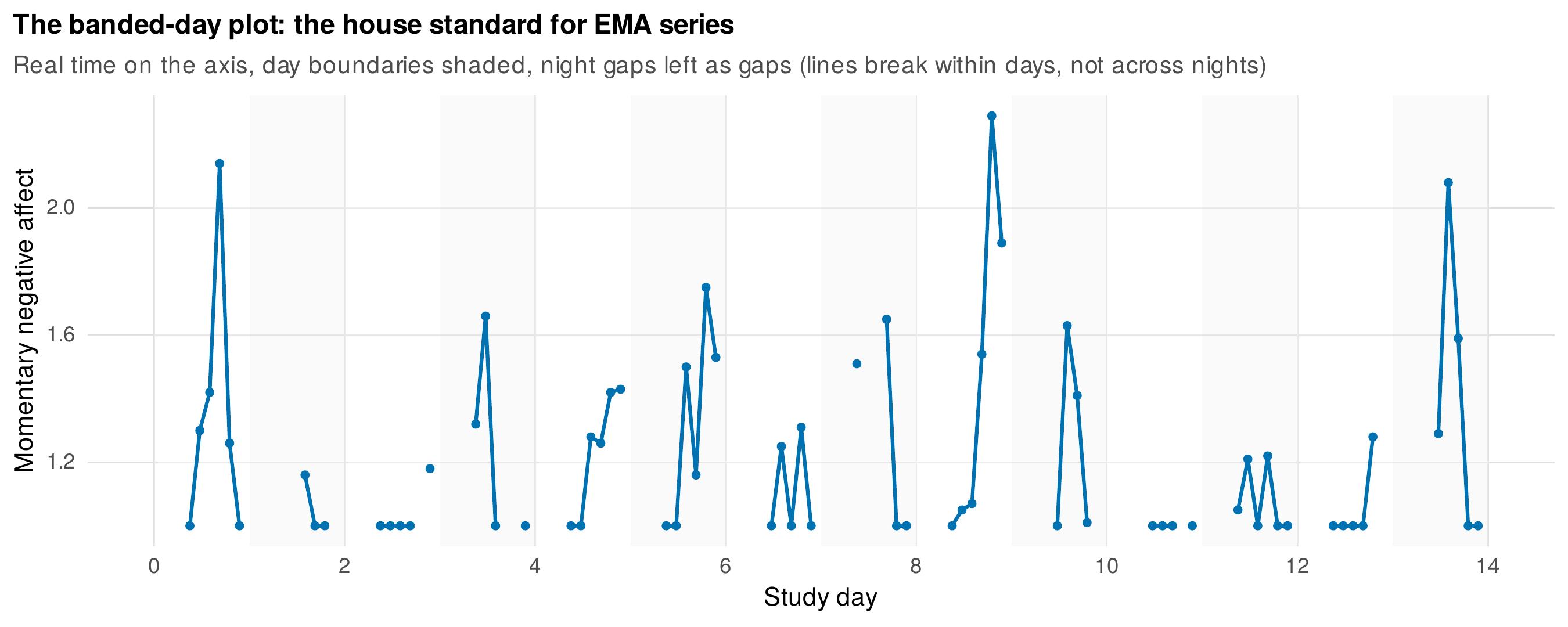
Note. One person’s momentary negative affect across fourteen days of six-beep sampling. Real time is on the axis, alternating bands mark days, and the connecting lines break at night rather than interpolating across the overnight gap. Missed beeps appear as gaps, not as imputed points.
Table 9.1. Dynamic feature and its canonical display.
| The feature of interest is … | The canonical display is … |
|---|---|
| Within-day and diurnal structure | Banded-day plot; diurnal profile by time of day |
| Response to events | Event-locked averaging around the event |
| One person in depth | N-of-1 exhibit: series with rolling statistics and ACF |
| Compliance and missingness | Person-by-prompt matrix; compliance decay curve |
| Inertia (autocorrelation) | Lag-1 scatterplot; autocorrelation function |
| Coupling of two series | Cross-correlation function; lead-lag display |
| State-space and regimes | Phase and state-space plots; rolling statistics; recurrence plot |
| Multivariate dynamics | Temporal and contemporaneous network graphs |
Note. As in Chapter 8, the display follows the question. The right-hand entries are developed in this chapter and become the visual companions to the dynamic models of Part VI.
Aggregating across the sample in a way that respects time yields the diurnal profile, the average level of a construct as a function of time of day. Figure 9.2 plots momentary negative affect against clock time, with the individual persons drawn as faint lines behind the group mean and its standard error, so that the display answers both of the two questions of Chapter 8, the typical daily shape and the variation around it, without hiding the second in the first. The event-anchored variant re-indexes the series around a meaningful event rather than clock time, and averages the event-locked curves as an electrophysiologist averages trials around a stimulus. Figure 9.3 applies this to stress episodes: aligning many high-stress moments at a common origin and averaging the negative-affect trajectory around them reveals a rise into the stress peak and a recovery afterward, a signal that is buried in any single raw series and that the averaging extracts. Event-locked averaging is powerful and underused in psychology, and it is the descriptive precursor of the within-person impulse-response ideas of Part VI.
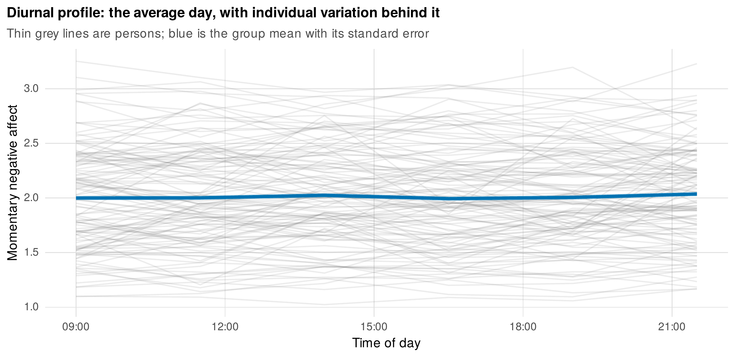
Note. Momentary negative affect by time of day. Thin grey lines are individual persons; the blue line and ribbon are the group mean and its standard error. The display shows the typical daily shape and the spread around it at once.
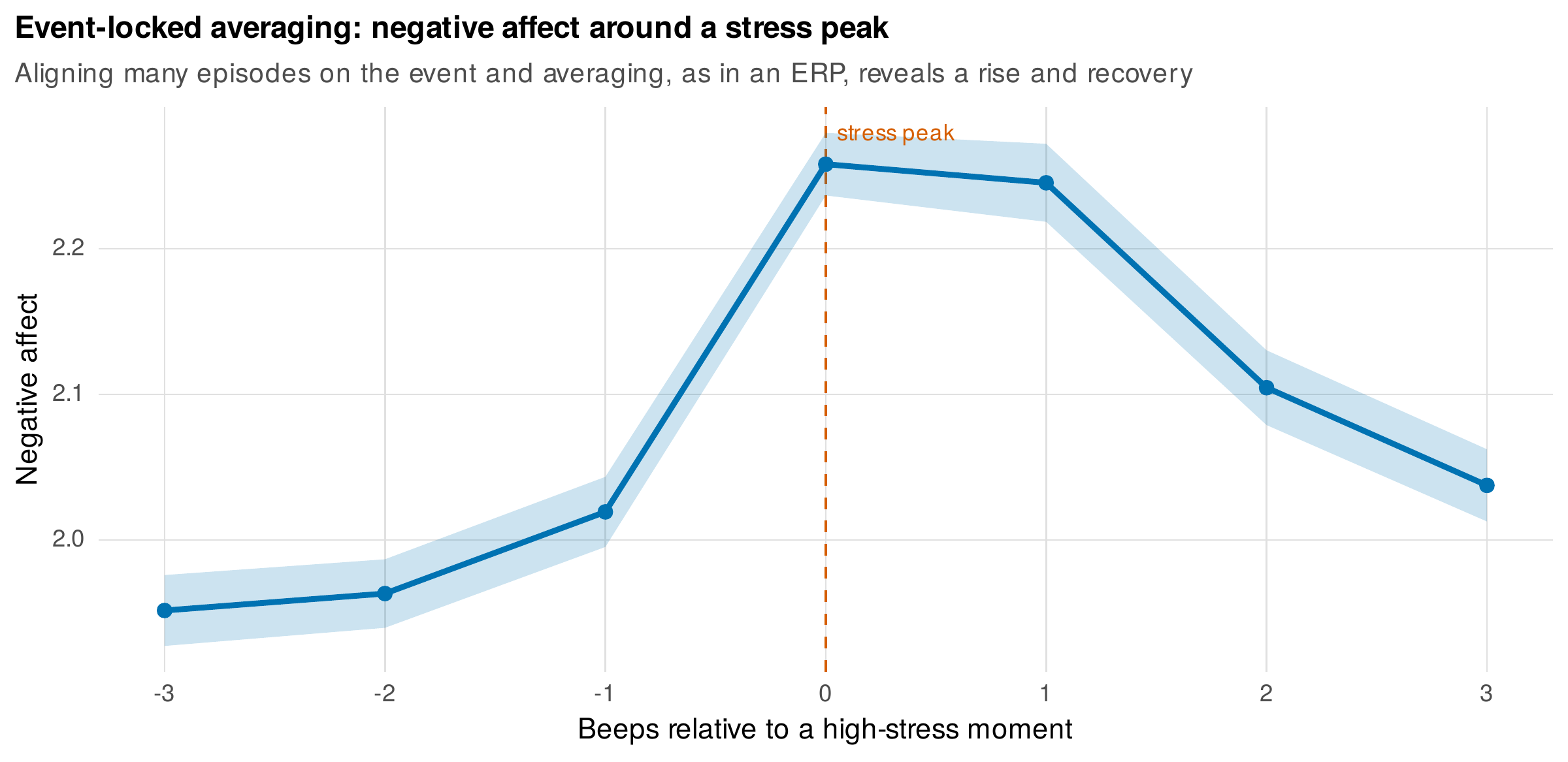
Note. Negative affect in a window of beeps around high-stress moments (beep zero), averaged across many episodes and persons as in an event-related potential. The rise into the peak and the recovery afterward emerge from the averaging; they are invisible in any single raw series.
The opposite of aggregation is the N-of-1 exhibit, a full display of a single person’s series that treats the individual as the unit of analysis. Figure 9.4 is the exhibit for the book’s single-subject mood dataset, which was generated with a hidden regime shift near day one hundred. The top panel shows the raw daily valence with a rolling mean, and the two lower panels show rolling-window statistics, the moving standard deviation and the moving lag-1 autocorrelation, each computed in a sliding window. The regime shift is barely visible in the raw series, but the rolling statistics expose it: as the transition approaches, the variance inflates and the autocorrelation rises, the signature that dynamical-systems theory calls critical slowing down and treats as an early-warning signal for an impending transition (Scheffer et al., 2009; Wichers et al., 2016). This N-of-1 exhibit, with its rolling-statistics panels, is the visual seed of the time-varying-dynamics and early-warning methods formalized in Chapter 32, and it is placed here so that the intuition precedes the model.
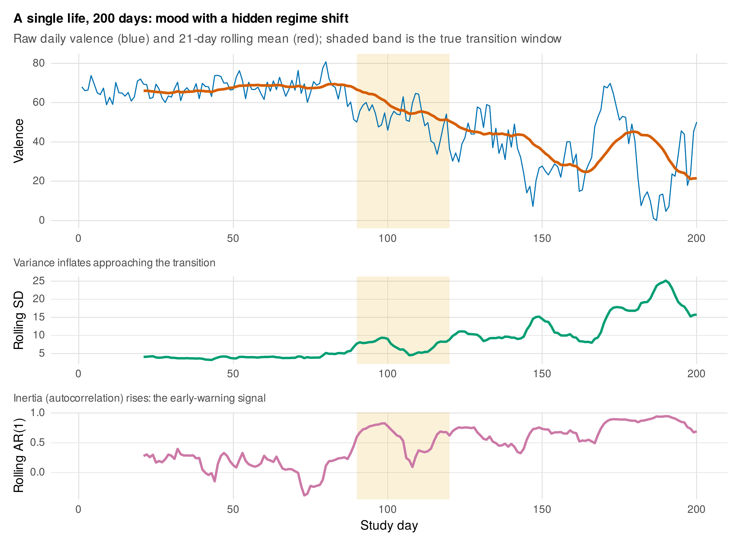
Note. A single person’s daily valence over two hundred days (top, with a rolling mean), the rolling standard deviation (middle), and the rolling lag-1 autocorrelation (bottom); the shaded band is the true transition window. The mean falls from about sixty-seven to about thirty-four, and, approaching the transition, the variance inflates and the autocorrelation rises from about \(0.34\) to about \(0.84\), the critical-slowing-down early-warning pattern. The rolling statistics reveal what the raw series conceals.
9.2 Seeing Missingness and Compliance
In intensive designs, missingness and compliance are not footnotes to be summarized in a single percentage but results to be displayed, because their pattern carries information about data quality and about the missingness mechanism of Chapter 6. Figure 9.5 shows the two essential displays. The left panel is a person-by-prompt matrix, each cell shaded by whether the scheduled beep was answered, with persons ordered by overall compliance, and it reveals at a glance what a mean cannot: that low compliance is concentrated in particular people and that response thins over the course of the study. The right panel makes the temporal decay explicit, plotting compliance against study day, and shows the characteristic decline from seventy-eight percent on the first day to sixty-five percent by the last, the fatigue that afflicts nearly every intensive protocol. These displays are the visual entry to the missing-data reasoning of Chapter 6.
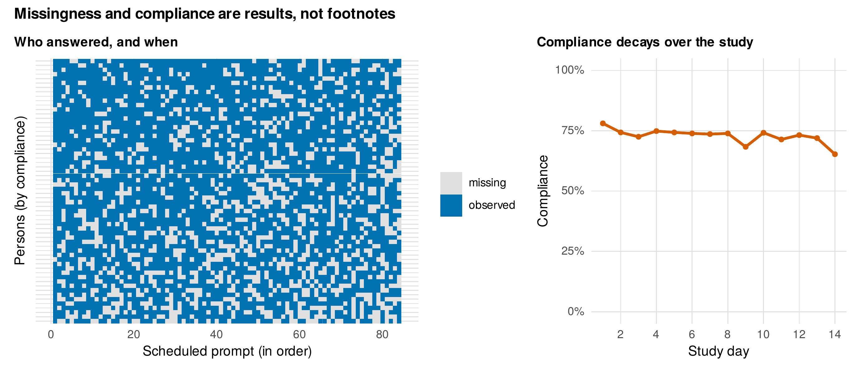
Note. Left: a person-by-prompt matrix, shaded by whether each scheduled beep was answered, with persons ordered by compliance; low compliance concentrates in particular people and response thins over time. Right: compliance by study day, declining from about seventy-eight to about sixty-five percent, the fatigue typical of intensive protocols.
Beyond describing how much is missing, a display can show whether the missingness is informative, that is, related to the very values that go unobserved. Figure 9.6 makes this visible for the book’s experience-sampling data, whose generating process was built so that momentary negative affect raises the probability of skipping the next prompt. The display compares the observed negative affect at beeps immediately preceding a missed prompt with that at beeps preceding an answered one, and the former is reliably higher, \(2.05\) against \(1.99\), so that the skipped beeps are not a random subsample but are systematically preceded by worse affect. This is the missing-not-at-random reasoning of Chapter 6 rendered graphically, and it is a display every intensive study should produce, because a visible pre-gap elevation is direct evidence that the missingness cannot be ignored without thought.
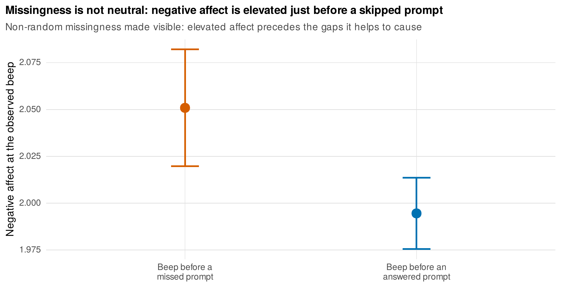
Note. Observed negative affect at beeps immediately before a missed prompt versus before an answered one, with \(95\%\) confidence intervals. The elevation before a gap (\(2.05\) versus \(1.99\)) is a visible signature that missingness depends on the momentary state, the mechanism reasoning of Chapter 6 seen directly in the data.
9.3 Displays of Dependence
The defining feature of intensive data is temporal dependence, and its most basic display is the lag-1 scatterplot, each observation plotted against the immediately preceding one. The slope of that scatter is the person’s inertia, the tendency of a state to carry forward, and Figure 9.7 shows a gallery of twelve persons whose lag-1 slopes range widely, from those who carry negative affect strongly from one beep to the next to those who barely do. This heterogeneity is the descriptive fact that the random autoregressive effects of Chapter 25 will model, and seeing it as a spread of slopes prepares the reader for a model in which inertia itself varies across people. The autocorrelation function generalizes the lag-1 slope to all lags, and Figure 9.8 shows the function for the same twelve persons: the bars are the correlations at successive lags, the grey band marks the region within which a correlation is negligible, and the differing decay patterns across persons reprise, at every lag, the heterogeneity that the lag-1 gallery showed at one. The autocorrelation function is read gently here and formalized in Chapter 24.
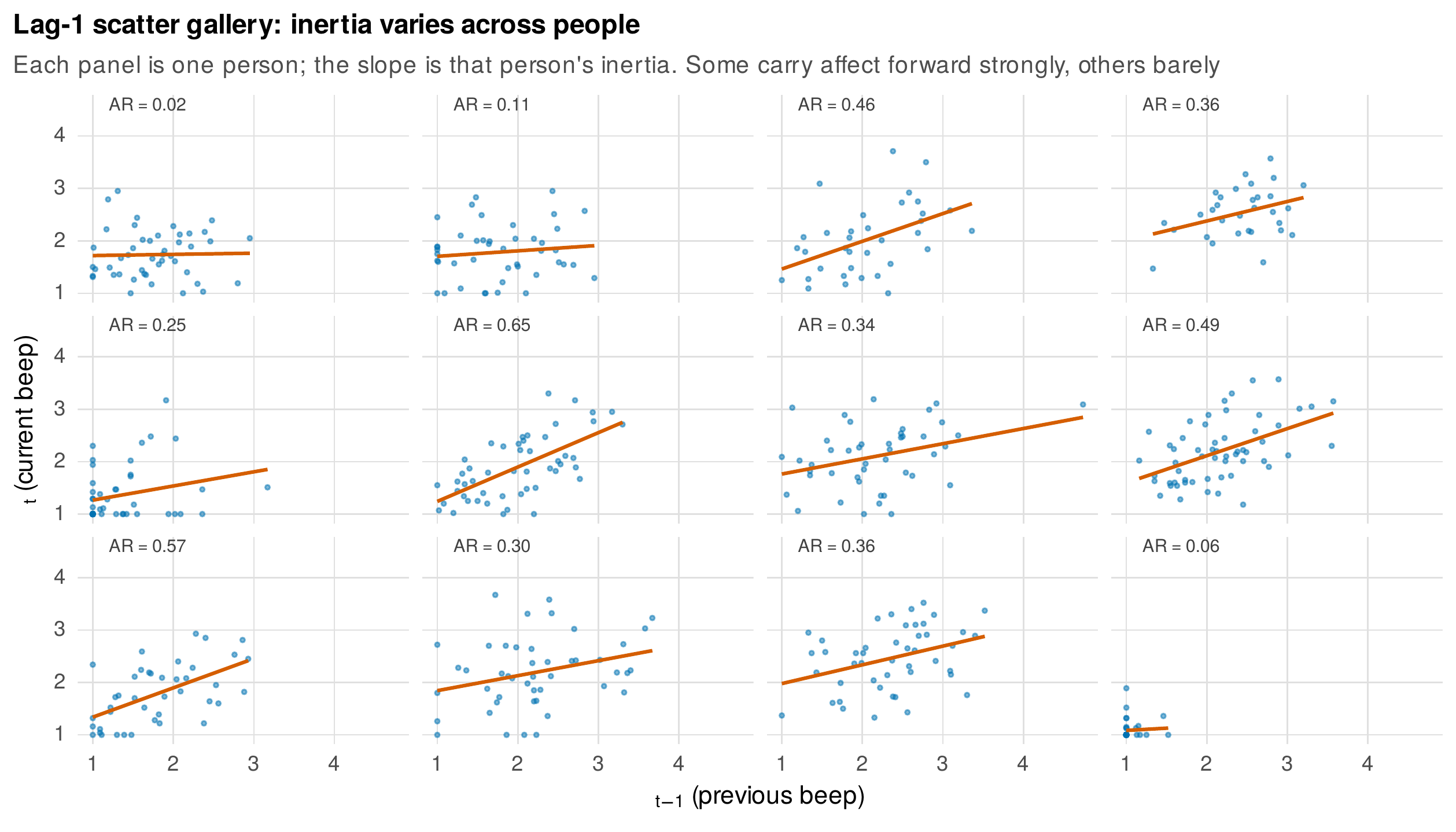
Note. For each of twelve persons, current negative affect against the previous beep’s value, with the person’s fitted slope. The slope is that person’s inertia; it ranges from strong carryover to almost none. This heterogeneity motivates the random autoregressive effects of Chapter 25.
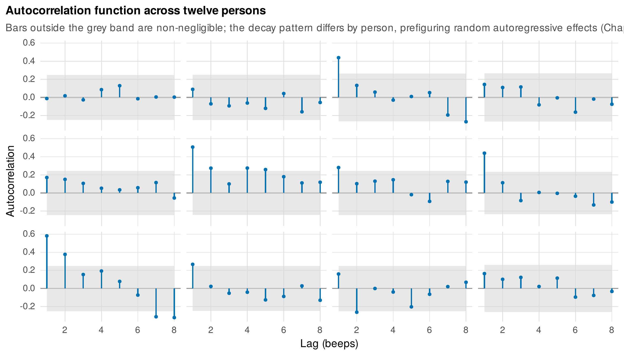
Note. The autocorrelation of negative affect at lags one through eight for twelve persons; bars outside the grey band are non-negligible. The decay pattern differs across persons, showing that temporal dependence is itself an individual difference.
Dependence between two series is displayed by the cross-correlation function, which correlates one series with the leads and lags of another and so reveals not only whether two constructs move together but whether one precedes the other. Figure 9.9 shows the average within-person cross-correlation of stress and negative affect: the function peaks at and just after lag zero, indicating that the two move together contemporaneously and that stress slightly precedes negative affect, a temporal ordering that a simple contemporaneous correlation would miss. The same machinery applied to two people rather than two constructs yields the display of dyadic coupling. Figure 9.10 shows four couples from the book’s daily-diary dyadic dataset, each partner’s negative affect plotted together, alongside the average cross-correlation of the two partners’ series across all couples. The cross-correlation is asymmetric, larger when partner A leads partner B than the reverse, recovering the lead-lag transmission that was built into the data, and it distinguishes two forms of dyadic coupling that a single correlation conflates: the shared same-day component that moves both partners together, visible as the peak at lag zero, and the lagged transmission by which one partner’s state predicts the other’s the next day.
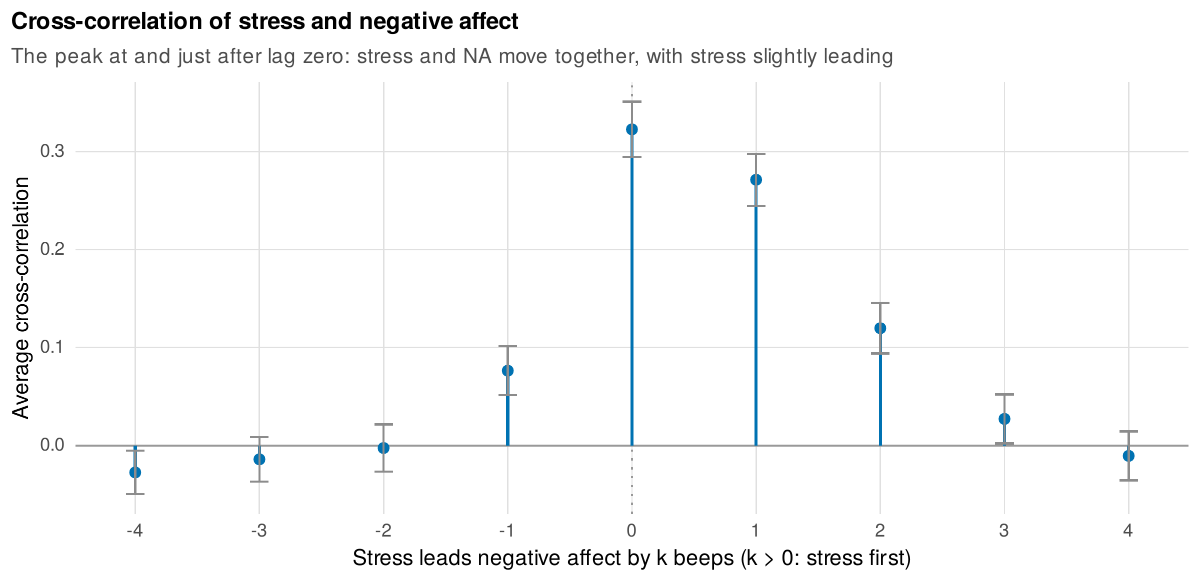
Note. The average within-person cross-correlation of stress and negative affect at leads and lags. The peak at and just after lag zero shows that the two move together and that stress slightly leads negative affect, a temporal ordering invisible to a contemporaneous correlation.
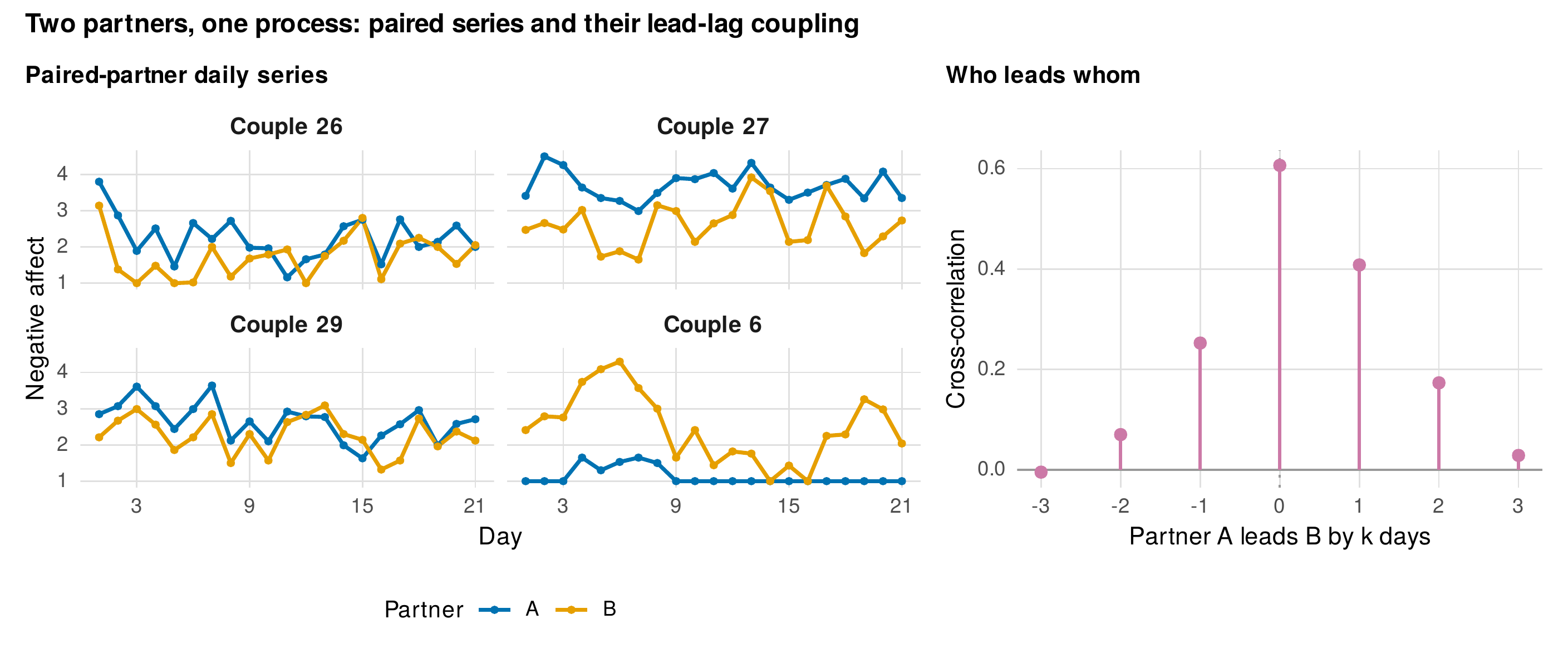
Note. Left: four couples’ paired negative-affect series (partners A and B). Right: the average cross-correlation of the two partners, which is larger when A leads B than the reverse, recovering the asymmetric transmission built into the data. The peak at lag zero is the shared same-day component; the asymmetry at nonzero lags is lagged transmission.
9.4 State-Space and Dynamical Displays
The displays of this section make dynamical-systems ideas visible while remaining epistemically modest: they suggest structure, they do not test for it. The state-space plot traces the joint trajectory of two coupled variables, here the valence and arousal of the single-subject series, with time encoded by color, so that the path through the affective plane becomes visible. The left panel of Figure 9.11 shows the trajectory drifting from a high-valence region early in the series to a low-valence region late, the regime shift appearing as a migration of the cloud through state space rather than as a step in a single variable. Its companion, the recurrence plot in the right panel, marks every pair of time points at which the system returned to a similar state, and the two regimes appear as two distinct blocks of recurrence, the visual fingerprint of a system that occupied one neighborhood of states and then moved to another. Recurrence plots are a teaser here and are quantified in Chapter 32; the honest framing is that these displays are suggestive descriptions, and the language of attractors and transitions they invite must not be mistaken for a fitted dynamical model. The rolling-statistics panels of the N-of-1 exhibit (Figure 9.4) belong to this same family, and together they are the descriptive origin of the time-varying and nonlinear dynamics of Chapters 27 and 32.
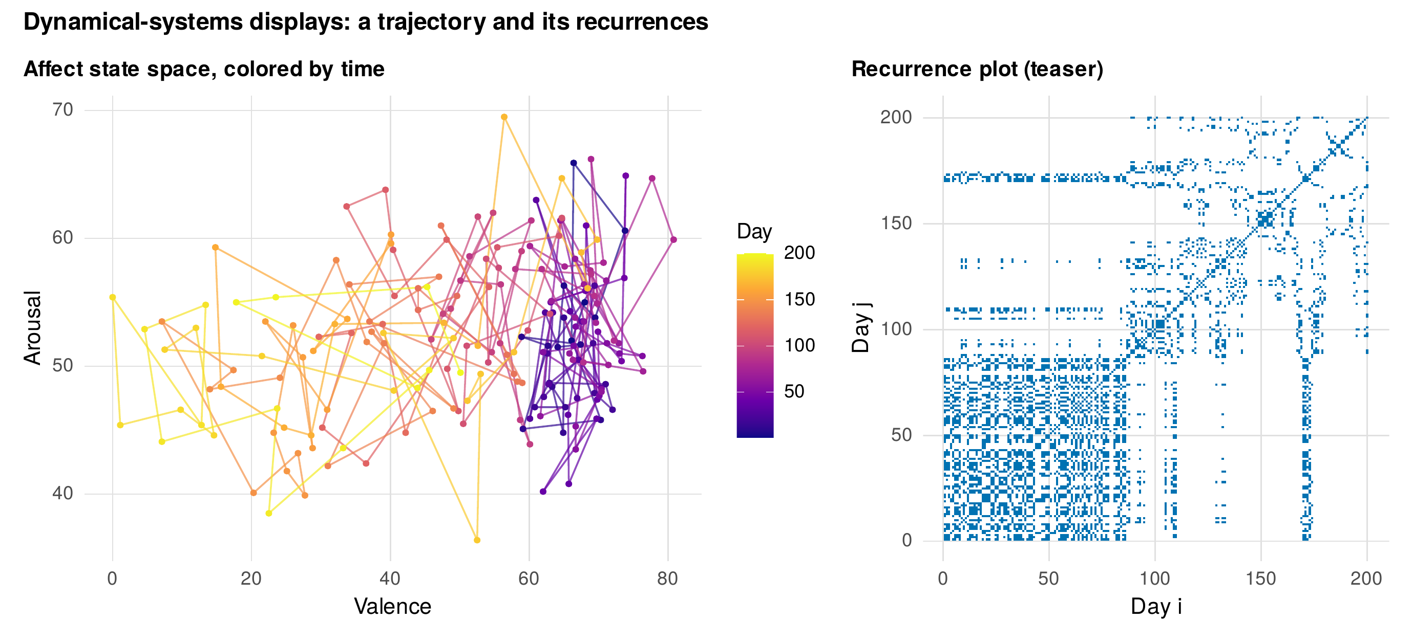
Note. Left: the state-space trajectory of valence and arousal for the single subject, colored by time, drifting from a high-valence region (early) to a low-valence region (late). Right: the recurrence plot, marking pairs of days in similar states; the two regimes appear as two recurrence blocks. These displays describe and suggest; they do not test for dynamical structure.
9.5 Network Visualizations
When several constructs are measured intensively, their dynamics can be displayed as a network, with variables as nodes and their associations as edges, and two networks are needed because two kinds of association coexist. The temporal network encodes lagged relationships, the extent to which each variable predicts another at the next occasion, and its edges are directed. The contemporaneous network encodes the partial correlations among variables measured at the same occasion, and its edges are undirected. Figure 9.12 shows both for the affect variables, drawn on an identical node layout so that the two panels can be compared, with edge width encoding strength and color encoding sign. Drawing the two on the same layout is not a cosmetic choice but a methodological requirement, because the spring-layout algorithms that position nodes are unstable across estimations and groups, so that apparent movement of a node between two differently-laid-out networks is an artifact of the algorithm, not a finding about the data. The third panel displays the edge uncertainty that published network figures too often omit: a bootstrap distribution for one temporal edge, showing that the edge is estimated with substantial uncertainty even in a large sample. Table 9.2 lists what every network figure must specify, and the caution is planted here that Chapter 28 will develop in full: a network display shows patterns of association, not causal structure, and its edges and its layout must both be read with care.
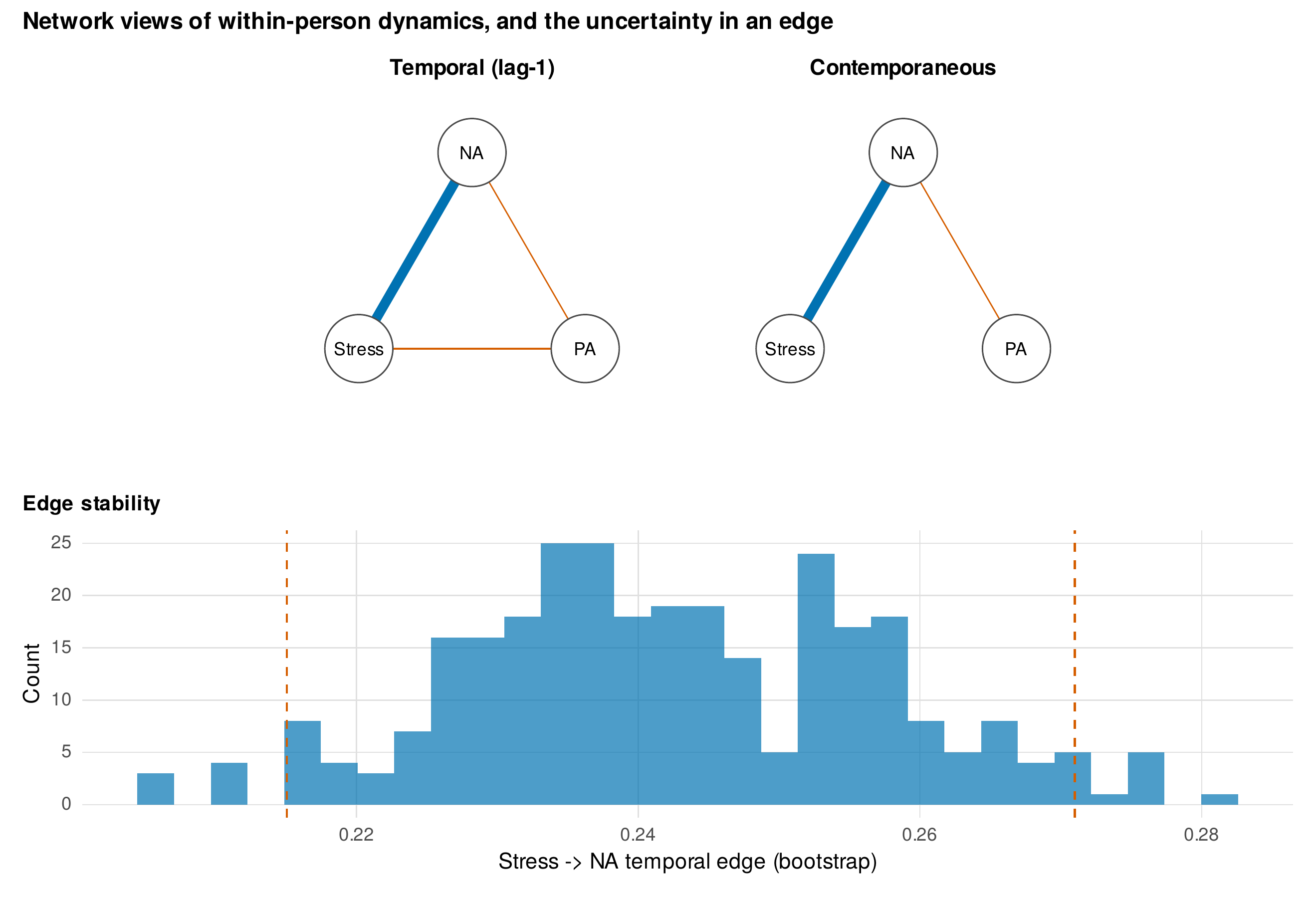
Note. Top: the temporal (lag-1, directed) and contemporaneous (partial-correlation, undirected) networks of negative affect, positive affect, and stress, drawn on an identical layout; edge width is strength and color is sign (blue positive, red negative). Bottom: a bootstrap distribution for the stress-to-negative-affect temporal edge, showing its estimation uncertainty. Networks must be compared on a fixed layout, because spring layouts are unstable across estimations.
Table 9.2. What every network figure must specify.
| Element | What to report |
|---|---|
| Edge meaning | Temporal (lagged, directed) or contemporaneous (partial correlation, undirected); the estimator used |
| Node layout | The layout algorithm and whether a fixed layout was used to compare panels or groups |
| Edge encoding | What width and color represent (magnitude and sign), and any threshold applied |
| Self-loops | Whether autoregressive (diagonal) effects are shown or omitted |
| Uncertainty | Edge-weight stability or confidence intervals, from a bootstrap or Bayesian posterior |
| Sample and level | Whether the network is within-person, between-person, or pooled, and the number of persons and occasions |
Note. A network figure without these specifications cannot be interpreted or reproduced. The layout and threshold in particular can change the visual impression dramatically without changing the underlying estimates.
9.6 Animation, Interactivity, and Monitoring Dashboards
Motion and interactivity earn their place in a display when they add inferential value rather than spectacle. Animation is justified when the object of interest is itself an unfolding, a trajectory moving through state space or a developmental process advancing in time, because then the temporal dimension that a static plot must encode with color or small multiples can be carried by actual motion; the state-space path of Figure 9.11 is the natural candidate, its color-encoded time becoming animated motion along the trajectory. Interactivity is justified when a series is too dense to show at once and the reader benefits from zooming and hovering, or when linked panels let a selection in one view highlight the same cases in another. The governing principle for publication is static-first: the primary figure must communicate on the printed page, with interactive versions offered as supplements, because a reader without the interactive tool must still be able to read the result. The final application is the monitoring dashboard for a running study. Figure 9.13 is a mockup of the essential panels, current compliance against its target, the distribution of incoming responses, and a ranked list of low-compliance participants flagged for follow-up, and Figure 9.14 sketches the architecture that produces it, a scheduled job that queries the incoming data, computes the summaries and the alert rules, and renders the panels. The dashboard is not a publication figure but an instrument of data collection, and its value is that it turns the compliance and missingness displays of Section 9.2 from a post-hoc autopsy into a live control.
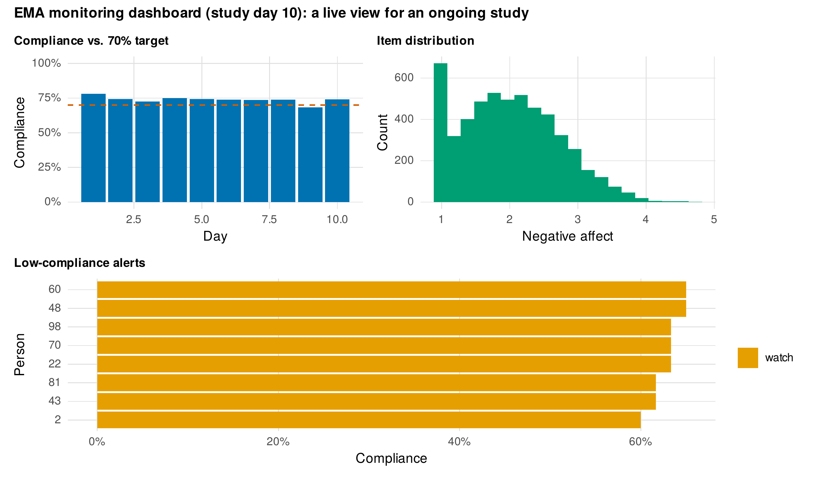
Note. A mockup of a live monitoring view on a chosen study day: compliance against a seventy-percent target, the distribution of incoming responses, and a ranked list of low-compliance participants flagged for follow-up. The dashboard turns the missingness displays of Section 9.2 into a real-time instrument of data collection rather than a post-hoc summary.
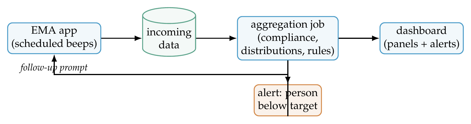
Note. A scheduled job queries the incoming experience-sampling data, computes compliance, item distributions, and alert rules, and renders the dashboard panels. When a participant falls below target, an alert triggers a follow-up. The full application code lives in the companion repository; the chapter shows the architecture only.
9.7 Building the Displays in R
The banded-day plot is built by keeping real time on the axis, shading day boundaries, and grouping the line by day so that it breaks at night, and the house style is loaded once as in Chapter 8.
library(ggplot2); library(dplyr); library(tidyr)
source("Examples/R/theme_book_V01.R"); theme_set(theme_book())
ae <- readRDS("Examples/data/affect_ema.rds")

# --- Banded-day plot: group by day so lines break at night gaps ---
one <- filter(ae, person == 7)
ggplot(one, aes(hours, na, group = day)) +          # group=day => no overnight line
  geom_line(na.rm = TRUE) + geom_point(na.rm = TRUE) +
  labs(x = "Study time (hours)", y = "Negative affect")
Rolling-window statistics, the autocorrelation function, and the cross-correlation function are all available in base R, so the dynamic displays need no specialized package. A rolling statistic is a short sliding-window loop, and the autocorrelation and cross-correlation come from acf and ccf with plotting suppressed so the values can be redrawn in the house style.
# --- Rolling-window statistics for the N-of-1 exhibit ---
roll <- function(x, w, f) { n <- length(x); out <- rep(NA, n)
  for (i in w:n) out[i] <- f(x[(i - w + 1):i]); out }
n1 <- readRDS("Examples/data/n1_mood.rds")
n1$rsd <- roll(n1$valence, 21, sd)                  # rolling SD (variance inflation)
n1$rar <- roll(n1$valence, 21, function(z)          # rolling lag-1 autocorrelation
             cor(z[-length(z)], z[-1]))

# --- Autocorrelation and cross-correlation without the base plots ---
a  <- acf(na.omit(one$na), lag.max = 8, plot = FALSE)
cc <- ccf(one$stress, one$na, lag.max = 4, plot = FALSE, na.action = na.pass)
The temporal and contemporaneous networks are computed directly: the temporal edges are the coefficients of person-wise lag-1 regressions of each variable on the lagged set, and the contemporaneous edges are partial correlations obtained from the inverse of the concurrent correlation matrix; edge stability comes from resampling persons. The complete code for all thirteen figures, including the network layout and the bootstrap, is the shipped script ch09_figures_V01.R, and the two datasets introduced here are generated by gen_n1_mood_V01.R and gen_daily_couples_V01.R.
# --- Contemporaneous partial-correlation network from a precision matrix ---
vars <- c("na", "pa", "stress")
R  <- cor(aec[, vars], use = "pairwise.complete.obs")   # aec: person-centered
P  <- solve(R); pcor <- -cov2cor(P); diag(pcor) <- 0    # partial correlations
Software Note • optional infrastructure for intensive-data graphics
Nothing in this chapter requires a package beyond ggplot2, but three ecosystems repay attention as a study scales. The tsibble and feasts packages provide a tidy grammar for time-indexed data and its features, convenient when many series must be summarized uniformly. For networks, qgraph produces the conventional temporal and contemporaneous displays and bootnet their stability intervals; when using them, fix the layout with a saved seed and pass the same layout to every panel and group so that node position is comparable. For interactivity, plotly converts a ggplot to an interactive figure and shiny builds the monitoring dashboard as a live application; their availability and interfaces evolve, so verify against current documentation. The transparent base-R computations shown here remain the reproducible foundation beneath any of these conveniences.
9.8 Interpreting and Reporting Dynamic Displays
A reader of these displays must be told exactly what each shows, because their apparent structure is easy to over-read. A figure caption for an intensive-data study should state the time metric and how gaps are handled, the level at which a summary was computed, whether a smoother or rolling window was applied and with what width, and, for a network, every item in Table 9.2. A model paragraph for the intensive study of this chapter reads: “Momentary negative affect was displayed as banded-day series with overnight gaps preserved. Compliance declined from seventy-eight percent on day one to sixty-five percent on day fourteen, and negative affect was elevated at beeps preceding a missed prompt relative to those preceding an answered one (\(2.05\) versus \(1.99\)), indicating non-ignorable missingness (handled per Chapter 6). Within-person inertia, displayed as lag-1 scatterplots and autocorrelation functions, varied substantially across persons. Temporal and contemporaneous networks were drawn on a fixed layout, and edge stability was assessed by a person-level bootstrap.” Every clause names a design decision and refuses the false precision that an unlabeled smoother or an unstable layout would introduce.
9.9 Common Misconceptions
Several beliefs about dynamic graphics mislead. The first is that a network figure shows causal structure; its edges are associations, lagged or partial, and its layout is the output of an algorithm, so neither the presence of an edge nor the position of a node licenses a causal reading, a caution developed fully in Chapter 28. The second is that an attractor-looking state-space plot demonstrates a dynamical system; a trajectory that appears to orbit a region is a description of where the series went, not evidence for a fitted attractor, and the distinction between a suggestive picture and a tested model must be kept sharp. The third is that more interactivity means better communication; interactivity that a reader must operate to understand the result fails the reader who cannot, and the static-first principle holds that the printed figure must stand alone. A recurring practical question, how to show eighty persons by seventy beeps in one figure, is answered as in Chapter 8 by galleries, lasagna heatmaps, and aggregates shown with a few highlighted exemplars, never by eighty overplotted lines.
Common Pitfall • three ways a dynamic display deceives
First, interpolating across nights: connecting the last beep of one day to the first of the next asserts continuity across sleep and inflates apparent autocorrelation; group the line by day so it breaks at the gap. Second, comparing network layouts as if position were meaningful: because spring layouts are unstable, a node that sits in a different place in two networks may reflect only the algorithm, so fix the layout before comparing panels or groups. Third, smoothing then interpreting the smooth as data: a rolling mean or a loess curve is a summary imposed on the data, and its features, especially at the ends where the window is unbalanced, are partly artifacts of the smoother; plot the raw series behind the smooth and state the window width.
In Practice • hosting reproducible interactive supplements
Interactive figures earn their place as supplements, and they should be published in a form that survives. Export a self-contained HTML file that embeds its data and its rendering library, rather than one that calls a live server, so that the figure still works years later and behind a firewall; deposit it in the same open repository as the data and the generating script, and cite it with a persistent link. For a figure that is fundamentally a screenshot, such as a dashboard, archive both the image at publication resolution and the code that produced it, so the static record and the reproducible source both persist. The generating script, not the rendered artifact, is the object of record.
Chapter Summary
Intensive longitudinal data demand displays that the panel-scale tools of Chapter 8 cannot provide. The banded-day plot puts real time on the axis and leaves night gaps as gaps (Figure 9.1); the diurnal profile and event-locked average summarize within-day and event structure (Figures 9.2, 9.3); and the N-of-1 exhibit with rolling statistics exposes a regime shift through the critical-slowing-down rise in variance and autocorrelation that the raw series hides (Figure 9.4). Compliance and missingness are displayed as results, and informative missingness is made visible as an elevation of affect before a gap (Figures 9.5, 9.6). Dependence is shown through lag scatterplots and autocorrelation functions, whose heterogeneity across persons prefigures random dynamic effects, and through cross-correlation and dyadic lead-lag displays that separate shared from transmitted coupling (Figures 9.7–9.10). State-space, recurrence, and rolling-statistics displays suggest dynamical structure without testing for it (Figure 9.11). Temporal and contemporaneous networks are drawn on a fixed layout with their edge uncertainty shown, because layouts are unstable and edges are associations, not causes (Figure 9.12). Animation and interactivity are used where motion carries inference, under a static-first rule, and the monitoring dashboard turns missingness displays into a live instrument (Figures 9.13, 9.14). Every display in this chapter is the descriptive companion to a model in Part VI.
Where to Go Next
This chapter’s displays pre-teach the models of Part VI, and the correspondence is deliberate. The autocorrelation function and lag scatter (Figures 9.8, 9.7) become the single-subject time-series models of Chapter 24; their heterogeneity across persons becomes the multilevel autoregressive and vector-autoregressive models of Chapter 25; the cross-correlation and dyadic displays (Figures 9.9, 9.10) become the multivariate coupling of those same models; the state-space and rolling-statistics displays (Figures 9.4, 9.11) become the continuous-time models of Chapter 27 and the nonlinear-dynamics and early-warning methods of Chapter 32; and the network graphs (Figure 9.12) become the formal network models of Chapter 28. The monitoring dashboard reappears in the clinical applications of Chapter 33. The commitment carried forward is that each dynamic model, when it arrives, is introduced beside the picture defined here, so that the reader always sees the phenomenon before the equation.
Exercises
- 9.1 Build a banded-day plot. For a provided messy intensive series with missed beeps and overnight gaps, produce a banded-day plot that keeps real time on the axis and breaks lines at nights, and explain what a naive line plot would have implied.
- 9.2 Event-locked display. Using event-contingent data, align the outcome around the events and produce an event-locked average with an uncertainty band, and write the one-sentence interpretation it supports.
- 9.3 See inertia. From a lag-1 scatter gallery, judge visually which persons show strong inertia, then check your judgments against their autocorrelation functions, and report where eye and statistic agree and disagree.
- 9.4 Honest networks. Re-render a provided pair of temporal and contemporaneous networks on a fixed shared layout, add edge-stability intervals from a person-level bootstrap, and write a caption that specifies every item in Table 9.2.
- 9.5 Extend a dashboard. Given the monitoring-dashboard mockup, add one alert rule (for example, flag any participant whose compliance falls below fifty percent over the last three days) and describe how the rule would change the follow-up workflow.
References
Bringmann, L. F., Ferrer, E., Hamaker, E. L., Borsboom, D., & Tuerlinckx, F. (2018). Modeling nonstationary emotion dynamics in dyads using a time-varying vector-autoregressive model. Multivariate Behavioral Research, 53(3), 293–314. https://doi.org/10.1080/00273171.2018.1439722
Bringmann, L. F., Vissers, N., Wichers, M., Geschwind, N., Kuppens, P., Peeters, F., Borsboom, D., & Tuerlinckx, F. (2013). A network approach to psychopathology: New insights into clinical longitudinal data. PLoS ONE, 8(4), Article e60188. https://doi.org/10.1371/journal.pone.0060188
Epskamp, S., Borsboom, D., & Fried, E. I. (2018). Estimating psychological networks and their accuracy: A tutorial paper. Behavior Research Methods, 50(1), 195–212. https://doi.org/10.3758/s13428-017-0862-1
Epskamp, S., Cramer, A. O. J., Waldorp, L. J., Schmittmann, V. D., & Borsboom, D. (2012). qgraph: Network visualizations of relationships in psychometric data. Journal of Statistical Software, 48(4), 1–18. https://doi.org/10.18637/jss.v048.i04
Kuppens, P., Oravecz, Z., & Tuerlinckx, F. (2010). Feelings change: Accounting for individual differences in the temporal dynamics of affect. Journal of Personality and Social Psychology, 99(6), 1042–1060. https://doi.org/10.1037/a0020962
Marwan, N., Romano, M. C., Thiel, M., & Kurths, J. (2007). Recurrence plots for the analysis of complex systems. Physics Reports, 438(5–6), 237–329. https://doi.org/10.1016/j.physrep.2006.11.001
Scheffer, M., Bascompte, J., Brock, W. A., Brovkin, V., Carpenter, S. R., Dakos, V., Held, H., van Nes, E. H., Rietkerk, M., & Sugihara, G. (2009). Early-warning signals for critical transitions. Nature, 461(7260), 53–59. https://doi.org/10.1038/nature08227
Sievert, C. (2020). Interactive web-based data visualization with R, plotly, and shiny. Chapman and Hall/CRC. https://doi.org/10.1201/9780429447273
Tierney, N., & Cook, D. (2023). Expanding tidy data principles to facilitate missing data exploration, visualization and assessment of imputations. Journal of Statistical Software, 105(7), 1–31. https://doi.org/10.18637/jss.v105.i07
Tufte, E. R. (1990). Envisioning information. Graphics Press.
Walls, T. A., & Schafer, J. L. (Eds.). (2006). Models for intensive longitudinal data. Oxford University Press. https://doi.org/10.1093/acprof:oso/9780195173444.001.0001
Wichers, M., Groot, P. C., Psychosystems, ESM Group, & EWS Group. (2016). Critical slowing down as a personalized early warning signal for depression. Psychotherapy and Psychosomatics, 85(2), 114–116. https://doi.org/10.1159/000441458